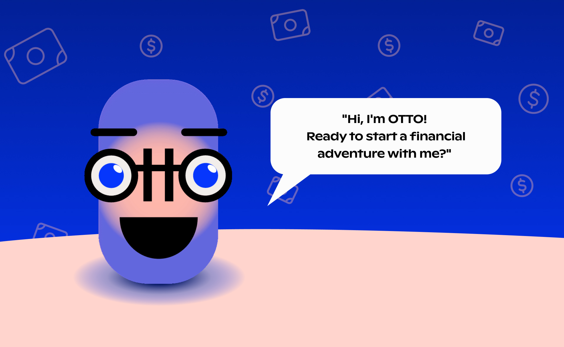
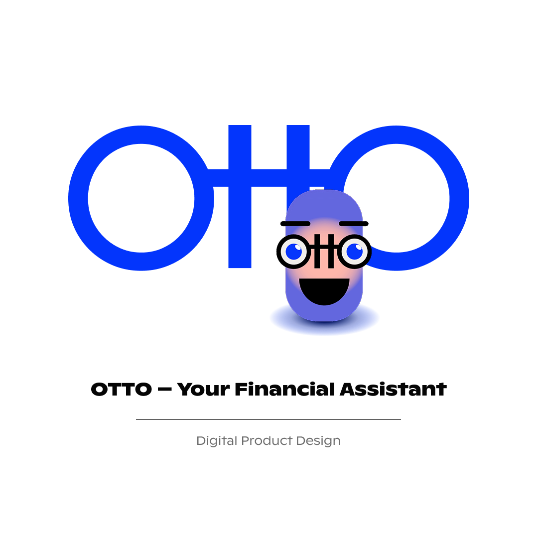
OTTO, your financial assistant
Finance app bringing what the users need to improve their financial life
About the project
I love the projects where you bring purpose and life change to people’s lives. This project, undoubtedly, could help many people, including myself, with money management.
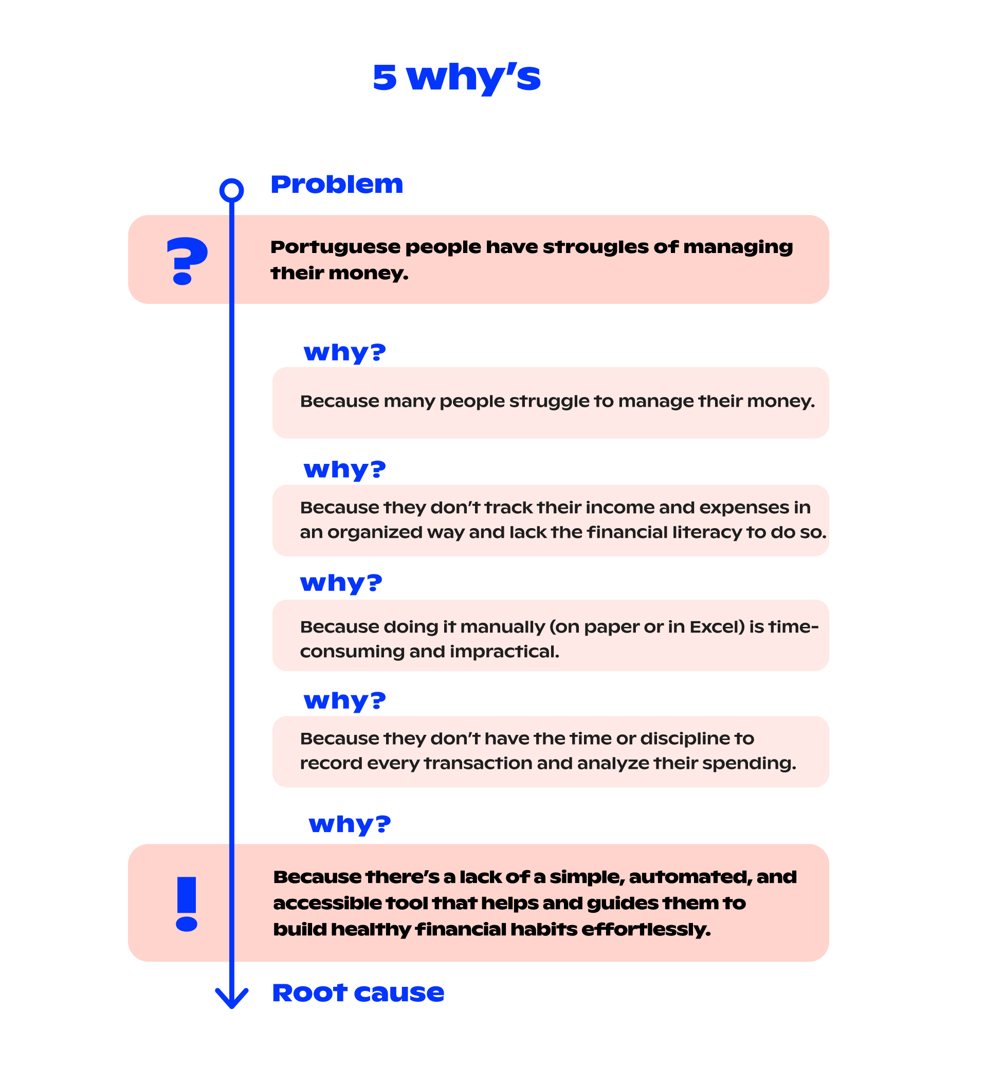
The initial problem was the low financial literacy in the Portuguese population, poor financial habits, and lack of control over expenses. Everyone knows that we, Portuguese, have one of the lowest levels of financial literacy in Europe. So, how could we help? An app seemed like a good solution.
But the truth is: there are already many finance apps on the market. However, in the business world, you don’t always need to invent something completely new — you can also improve what already exists. We took this as a challenge.
I say “we” because I had amazing teammates: Ana Fidalgo and Sofia Rodrigues. This project aimed to explore the entire digital product design process, and my role was UX and UI Designer.
The project’s scope encompassed:
Research & Time Mapping
This is the phase where we challenge our assumptions and let ourselves be surprised by real data.
But first, time management. It was important to organize the time we had available. We created a roadmap that outlined the main tasks and estimated the time to complete each.
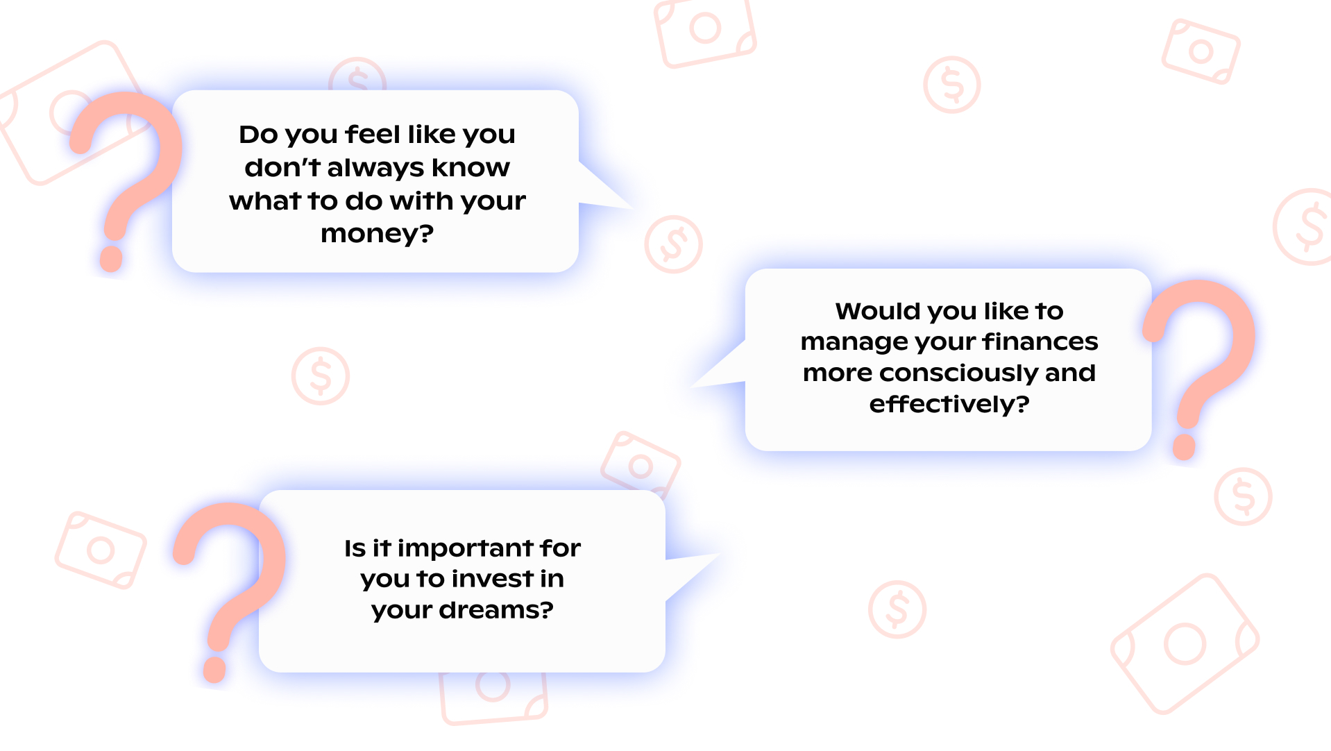
Understanding the core problem was essential, of course. Good products need to solve real problems. Otherwise, it will be just one more in the market that the users experience by curiosity, but don´t keep using it. I love the 5 Whys methodology for this, and it proved very useful in this case.
Surveys
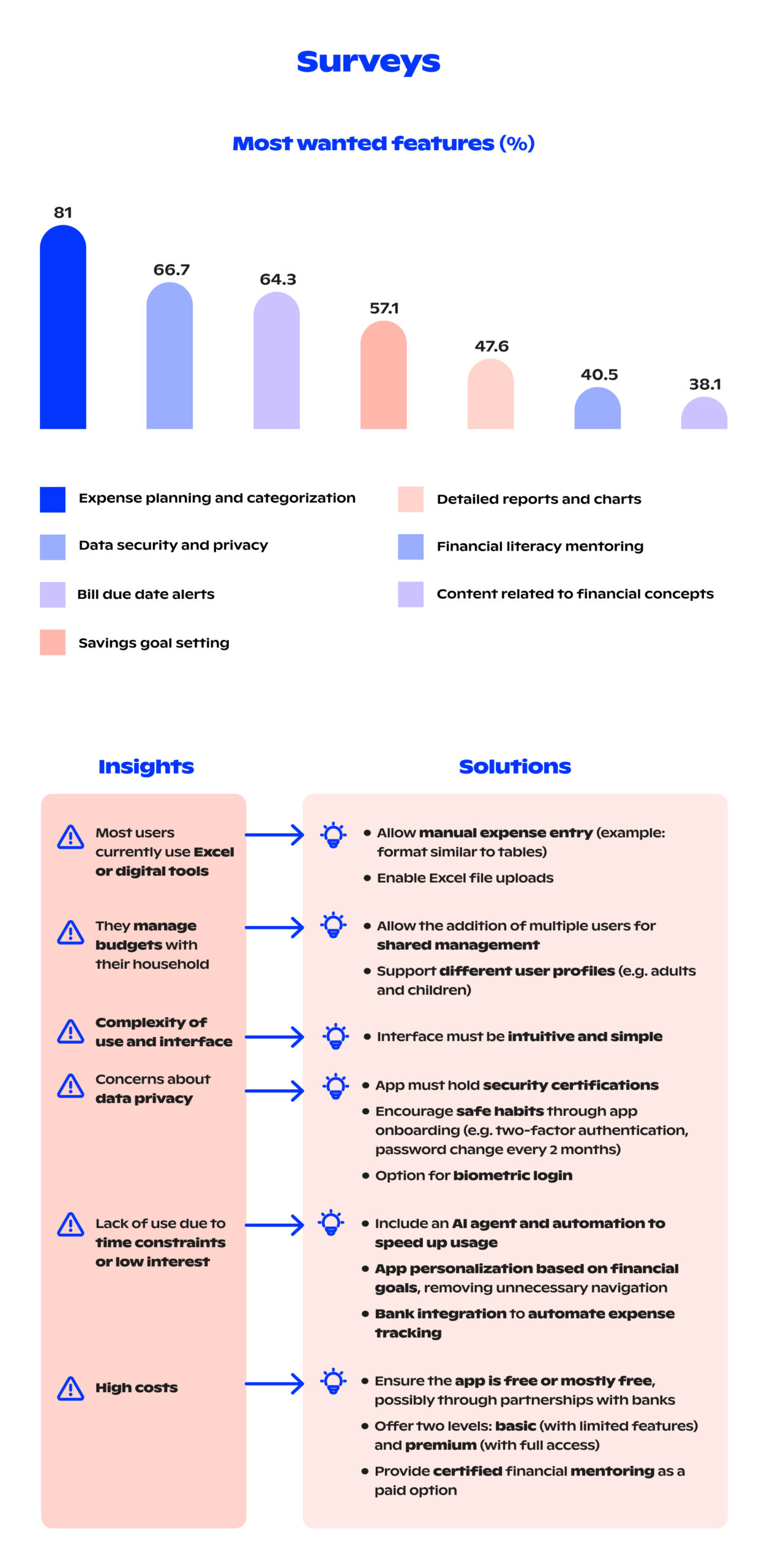
We created a survey to understand deeply our target audience, their needs, and pain points. In a short amount of time, we received a satisfying number of relevant responses. Easily, we started to have a big picture of what was going on with this audience of millennials. It is also interesting to note that 78% were female gender.
Below are some of the most valuable insights we uncovered.
Benchmarking
Once we understood our users, we looked into our competitors doing a benchmark. Exploring other apps in detail helped us identify what worked well, what didn’t, and where there were opportunities to improve.
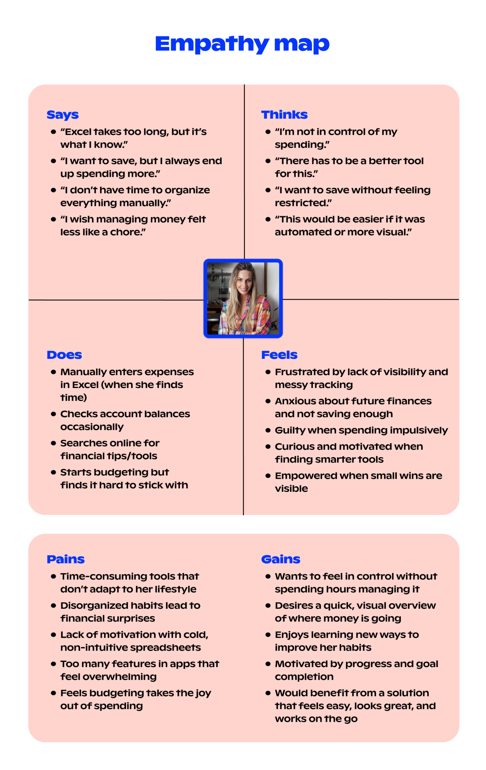
Personas
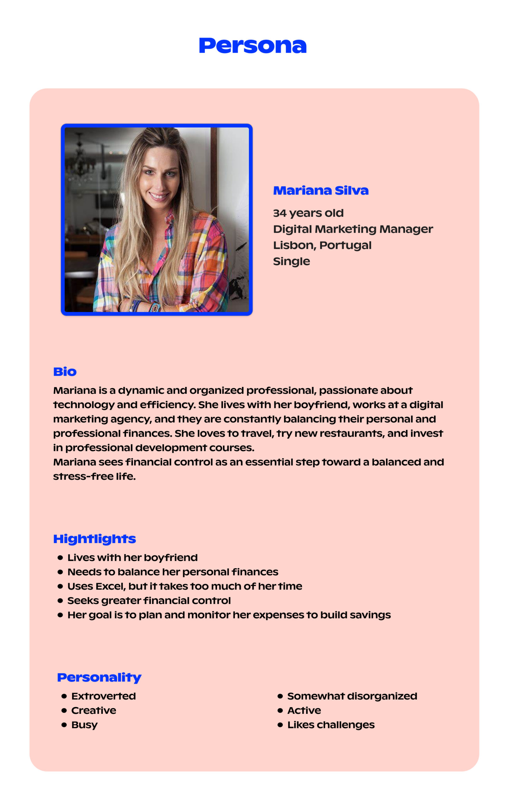
Based on our findings, we created two personas. Empathy is something really important when you need to get into somebody’s shoes, just like a UX designer needs to do. So, I also developed an empathy map to give more weight to the most critical user pain points.
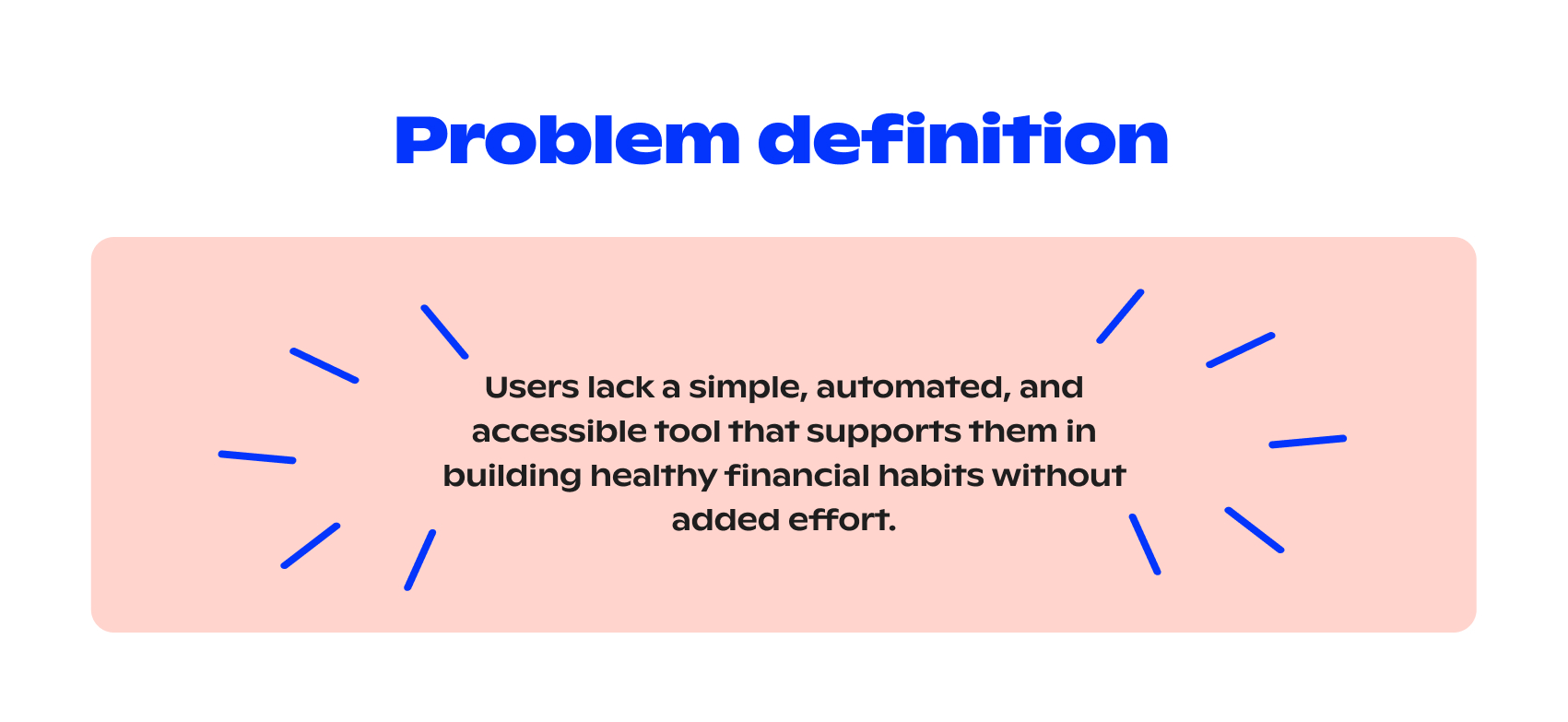
Problem Definition
After gathering and analyzing the data, we defined the main problem we needed to solve.
Ideation & Feature Selection
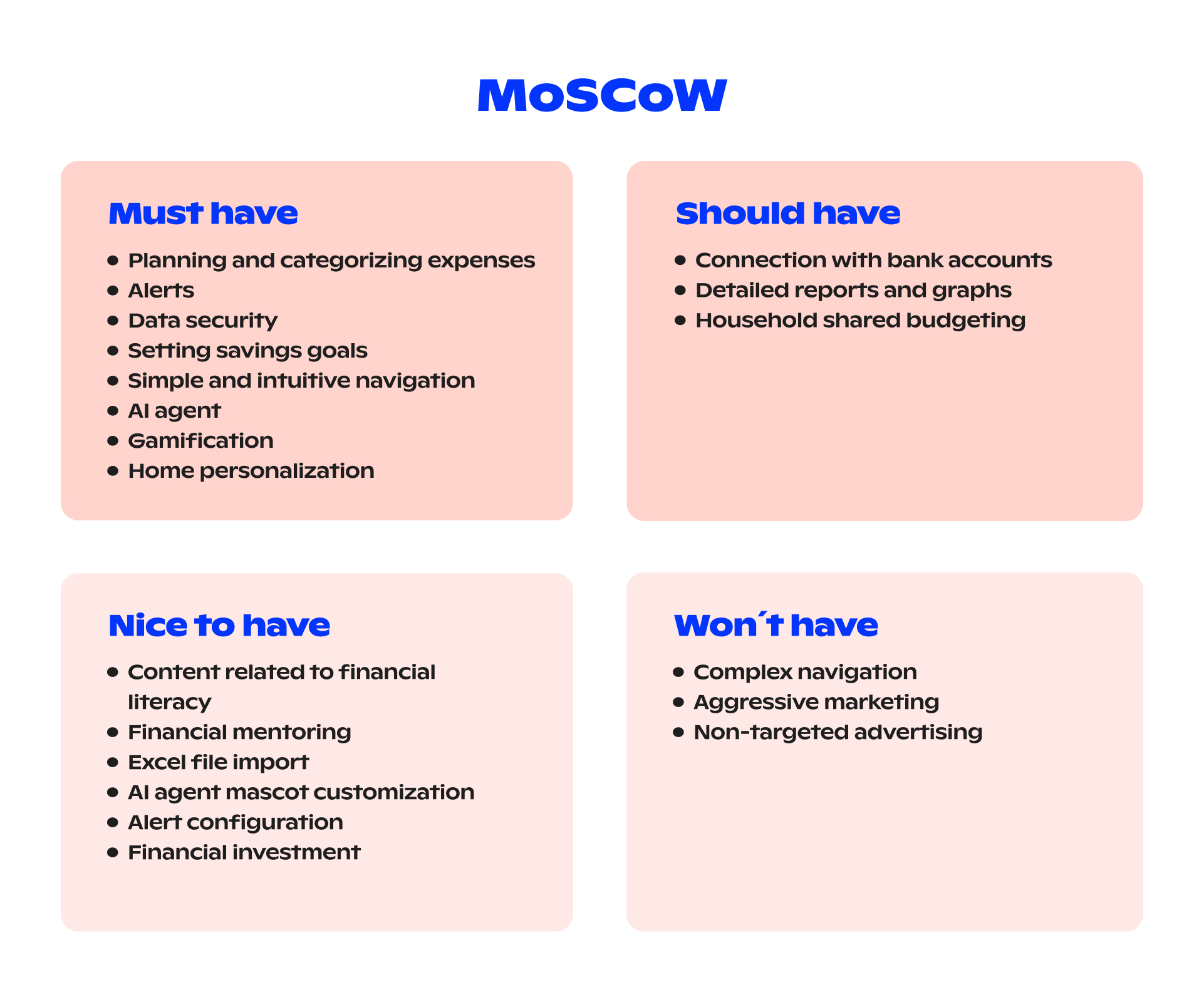
MoSCoW Prioritization
After brainstorming sessions and Crazy 8s, we gathered the most promising features and prioritized them using the MoSCoW method.
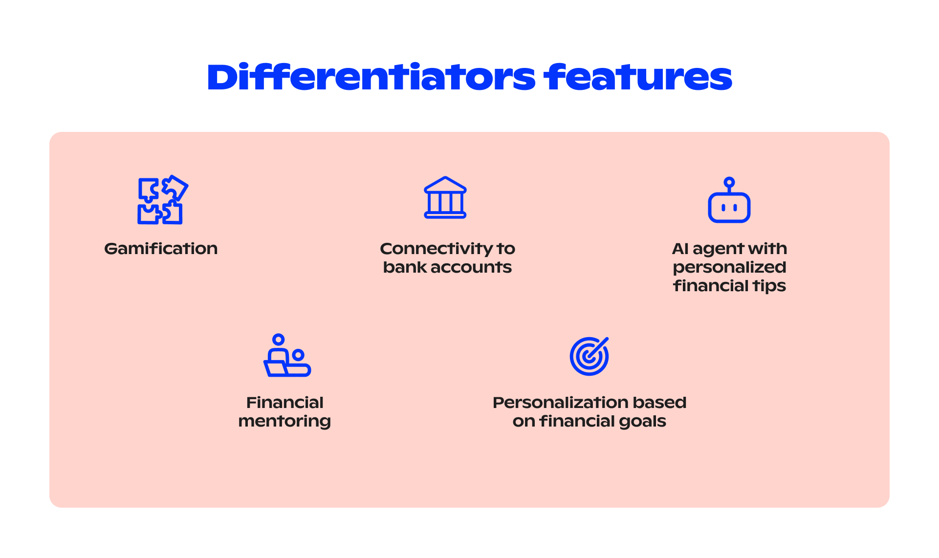
One challenge was connecting the app to bank accounts. There were legal and technical concerns. But after research was done, we confirmed that EU regulations allow this, as long as specific standards are met. So, we moved forward with this differentiating feature.
Two important features we aimed to have for a highly user-friendly emotional connection with the product. One is the personalization of the AI agent and app configuration, for example, the home dashboard. The other one is gamification, learning while having fun. This will keep the user coming back.
Of course, we didn’t forget our personas and their pains. We can say that almost all of Mariana’s struggles could be solved with our “Must have” and “Should have” features listed below.
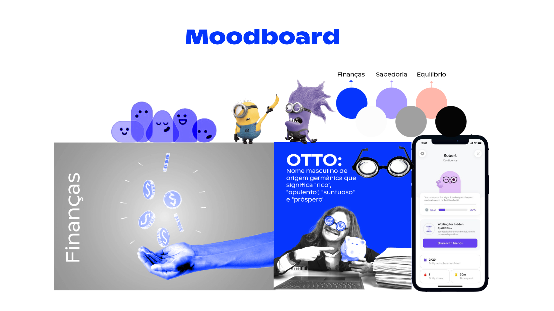
Visual Identity
I started imagining the visual identity early, especially after deciding to have an AI agent. The colors were chosen to reflect the mood we wanted: finance-related, friendly, light, and engaging. Here is the starting point to keep the users coming and staying.
The logo was cleverly optimized to become OTTO’s glasses — our AI mascot.
Information Architecture
This was a challenging part. We had to decide how to structure and group key features.
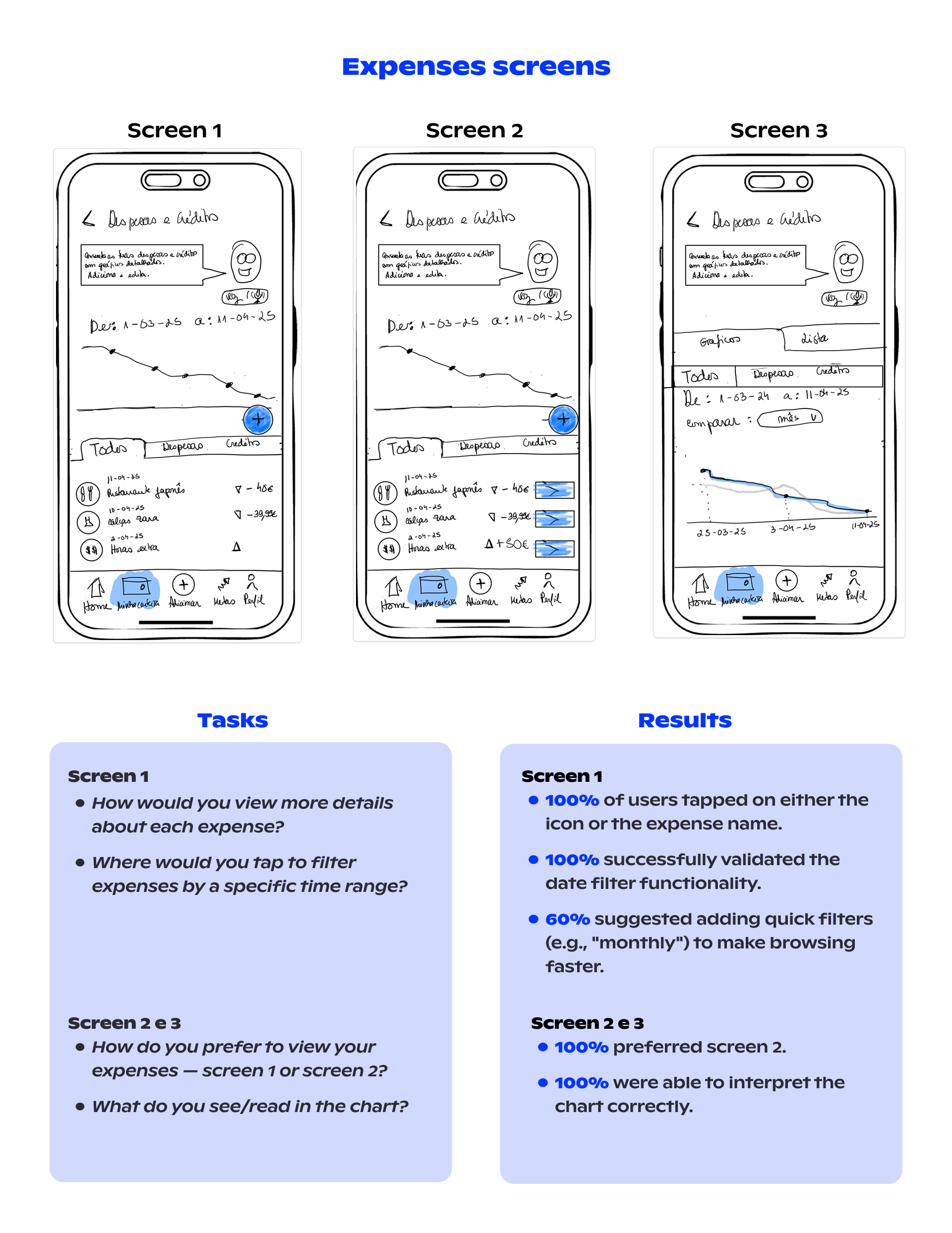
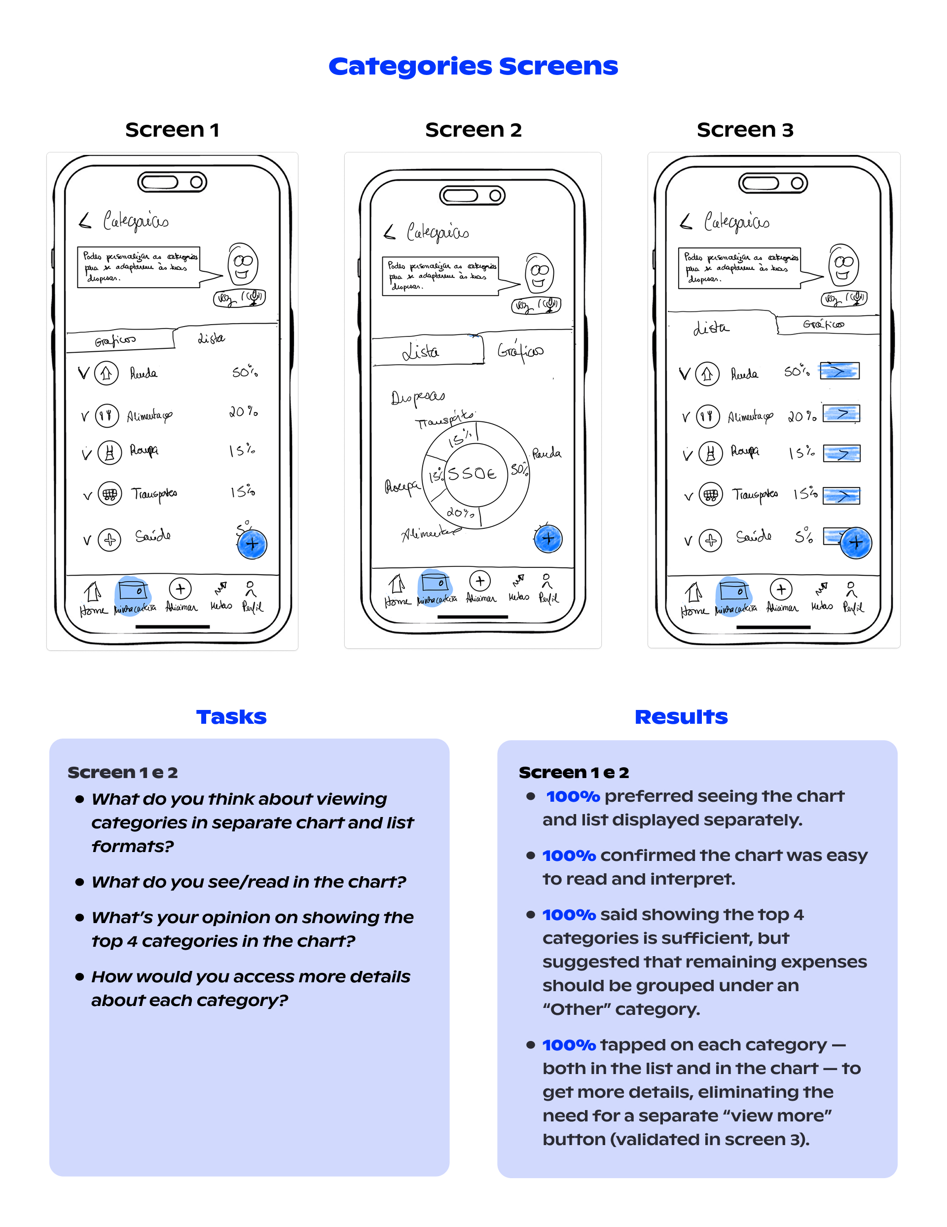
Most finance apps combine expenses and categories in one place. While it makes sense, it’s hard to edit categories that way. Through teamwork and discussion, we realized that separating expenses from categories would offer a clearer user journey. Of course, we tested this with the users.
Wireframes & Usability Testing
I designed the low to mid-fidelity wireframes. The initial plan was to create only low-fidelity, but our well-structured site map made it intuitive for me to proceed quickly to mid-fidelity. This saved us time and allowed us to begin usability testing with 5 users (the minimum for validation). I conducted 2 of the tests myself.
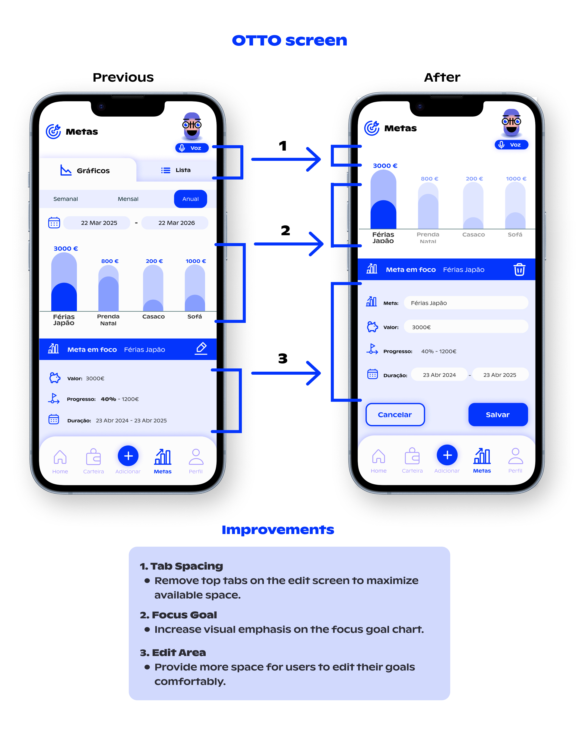
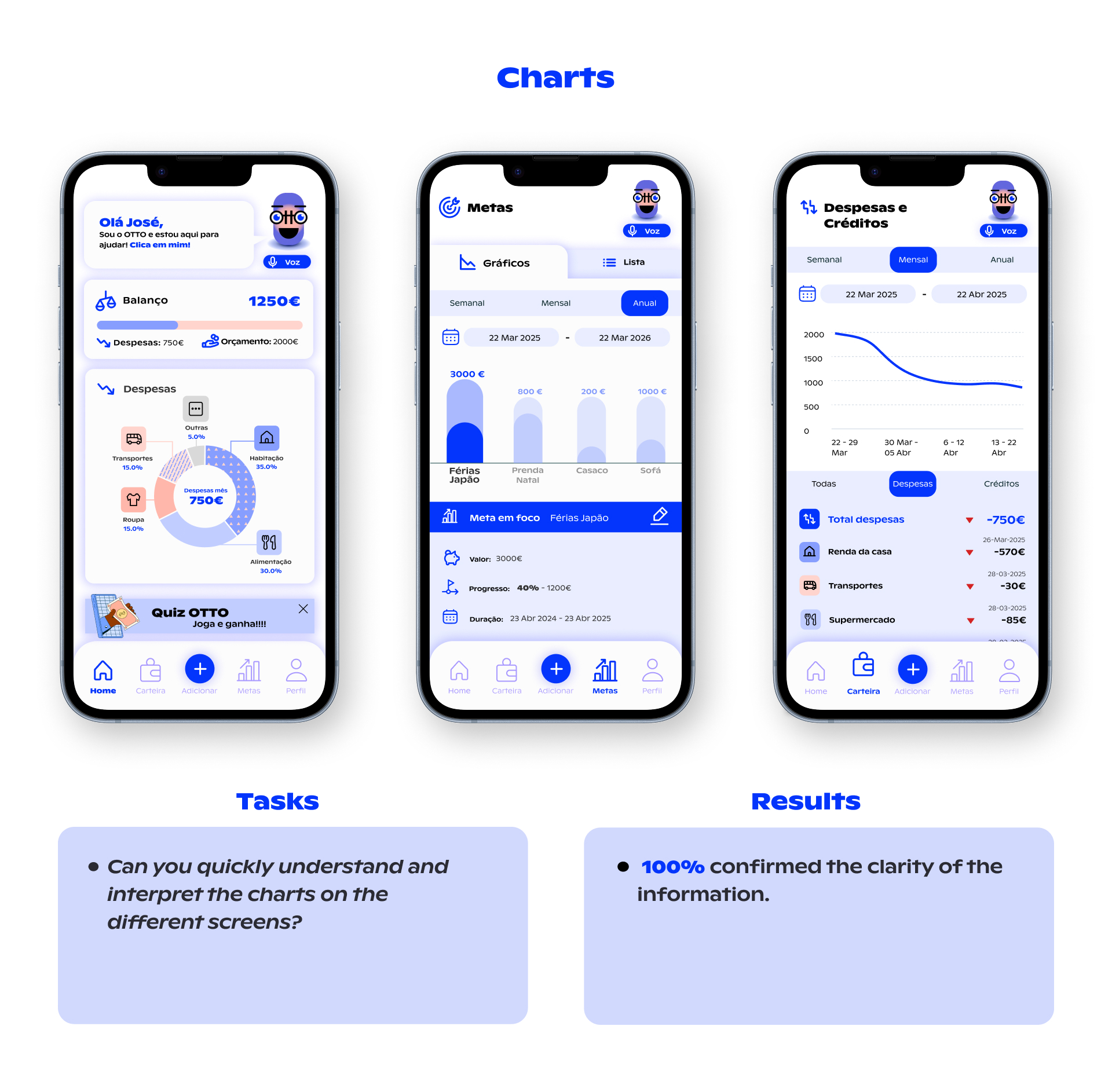
I also did deep research on data visualization, identifying the best types of charts for each kind of information. This helped make the financial data more readable and useful.
While working on this, I also began creating some high-fidelity screens for my own visualization. These turned out to be useful, so we included them in the usability tests.
Key Findings for the next phase
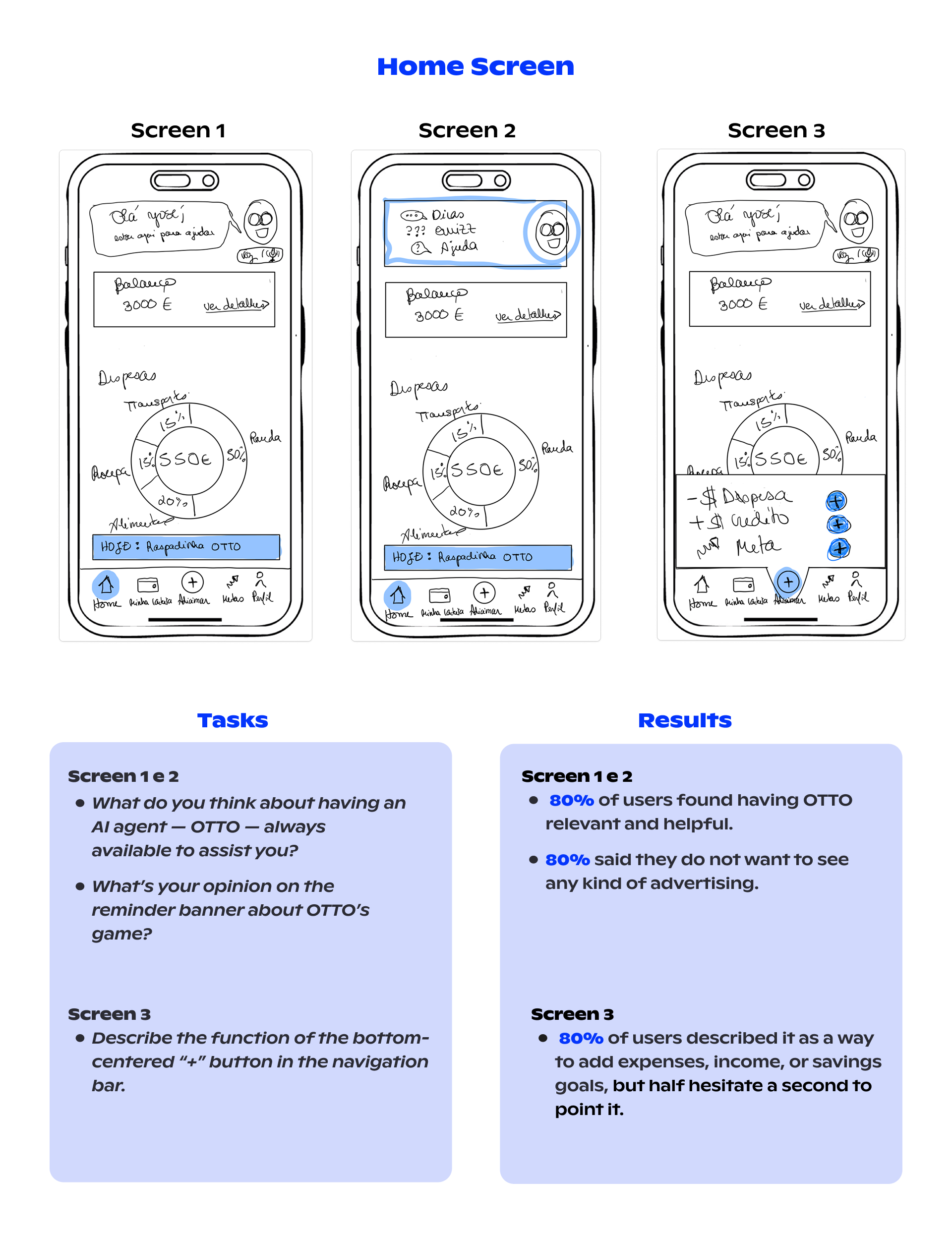
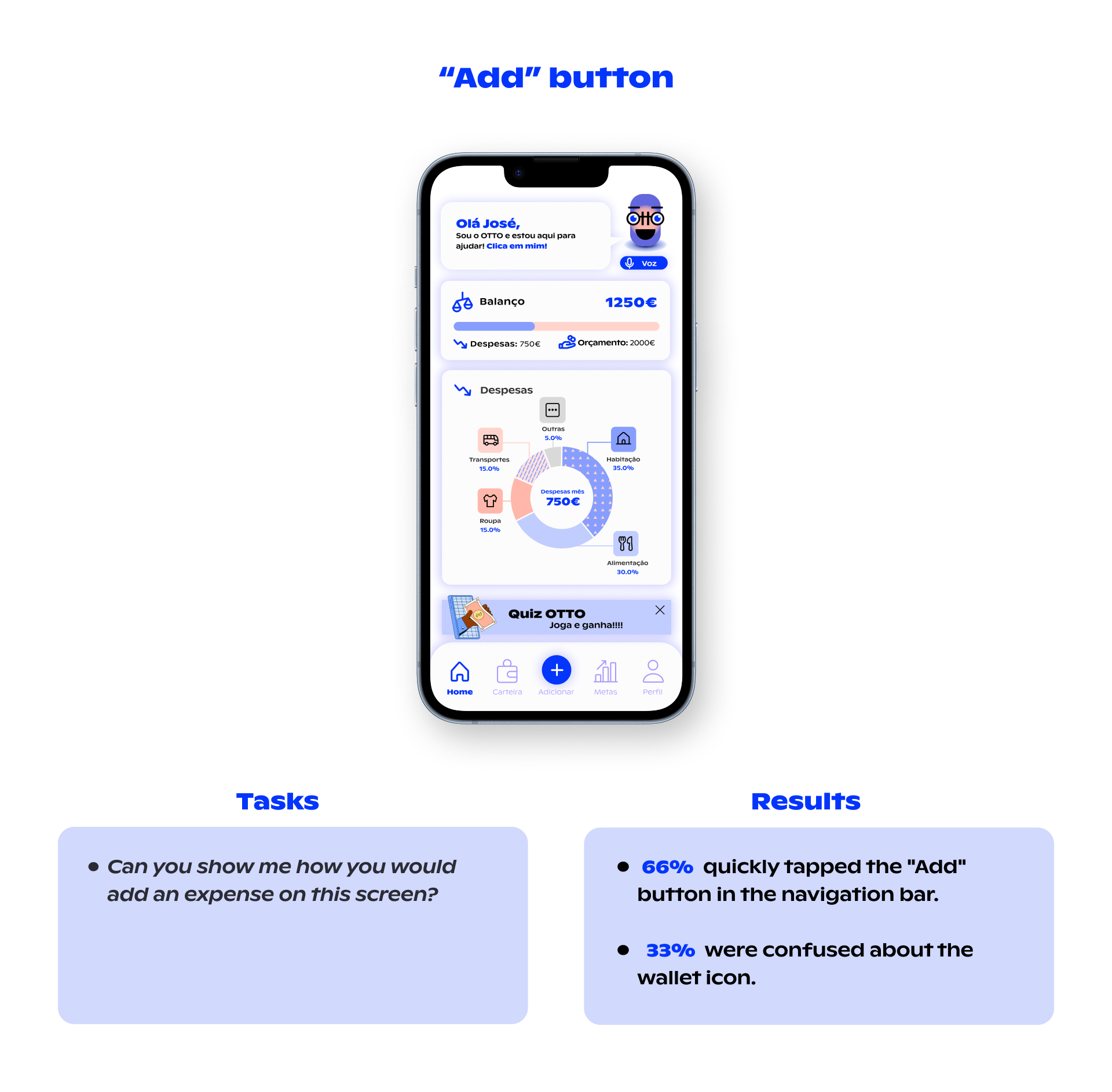
One issue we found was the “+” icon in the bottom navigation bar. Although 80% of users clicked it, about half hesitated before doing so. We considered re-testing this with improved high-fidelity prototypes. And this was one of my beginning assumptions being beaten.
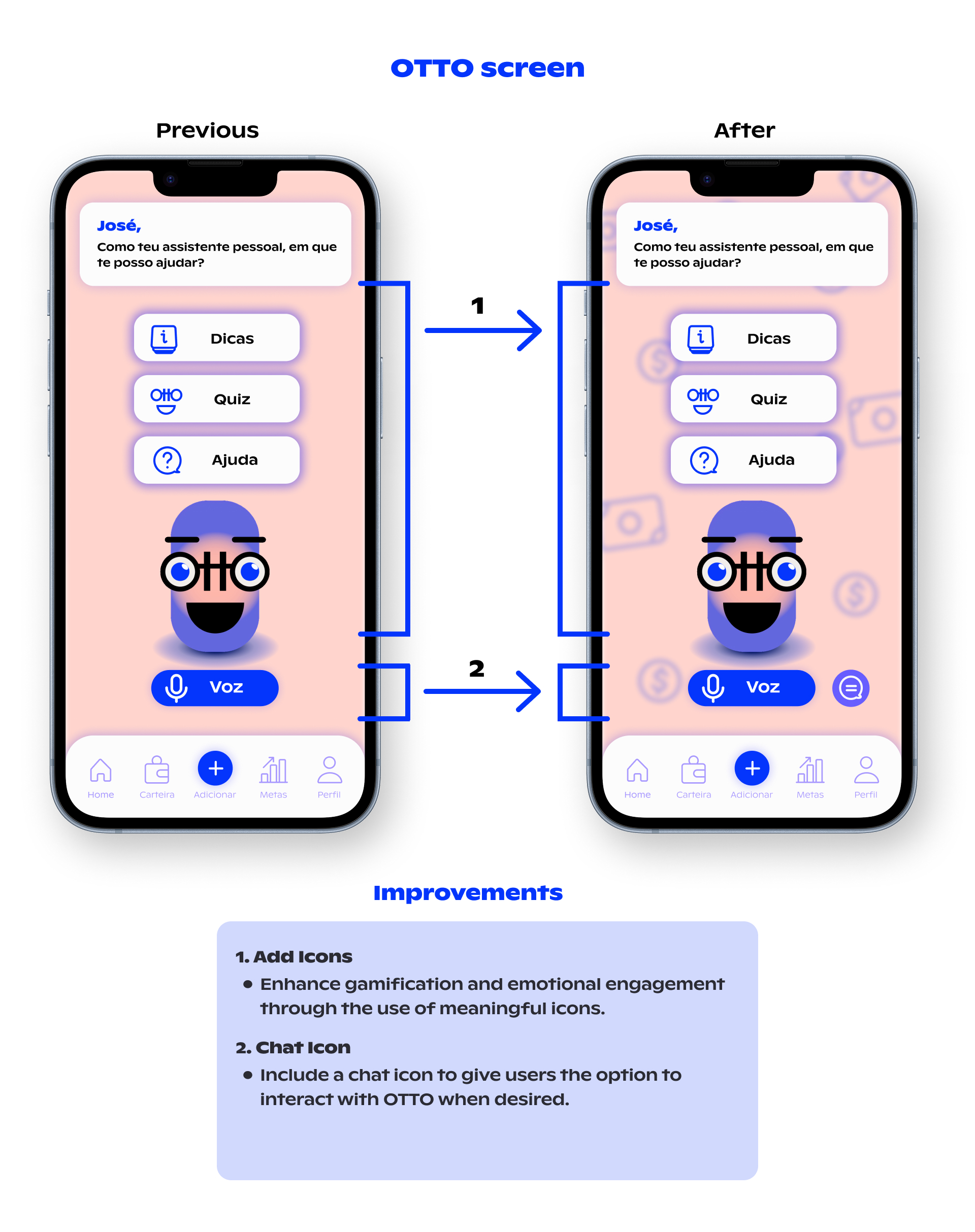
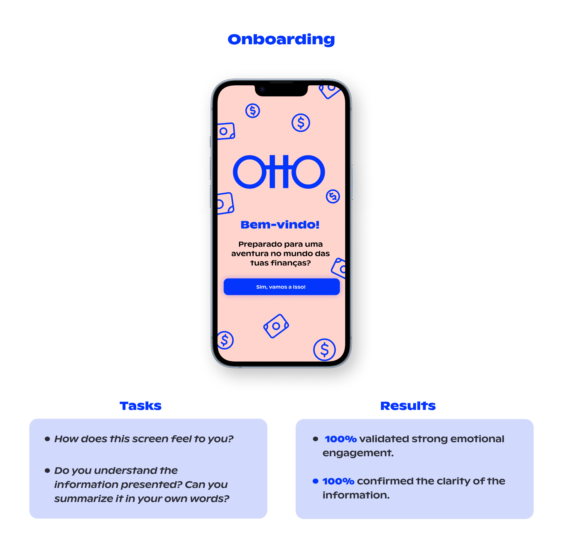
Another thing was the OTTO clickable feature. Users didn’t find evidence that OTTO was interactive. So one thing to take into consideration was to create its animation and point this on the onboarding process.
Prototyping & Final Testing
Prototype
This is the phase where the app starts to get its mood, spirit, and personality — for me, it feels like “dressing up” the product.
The main concernings here were:
Team testing
I was the only designer on the team, so I led most of the work. But it was still a collaborative process. I constantly tested with my teammates, and they provided valuable insights to improve the prototype. This allowed us to test a much more polished version with users.
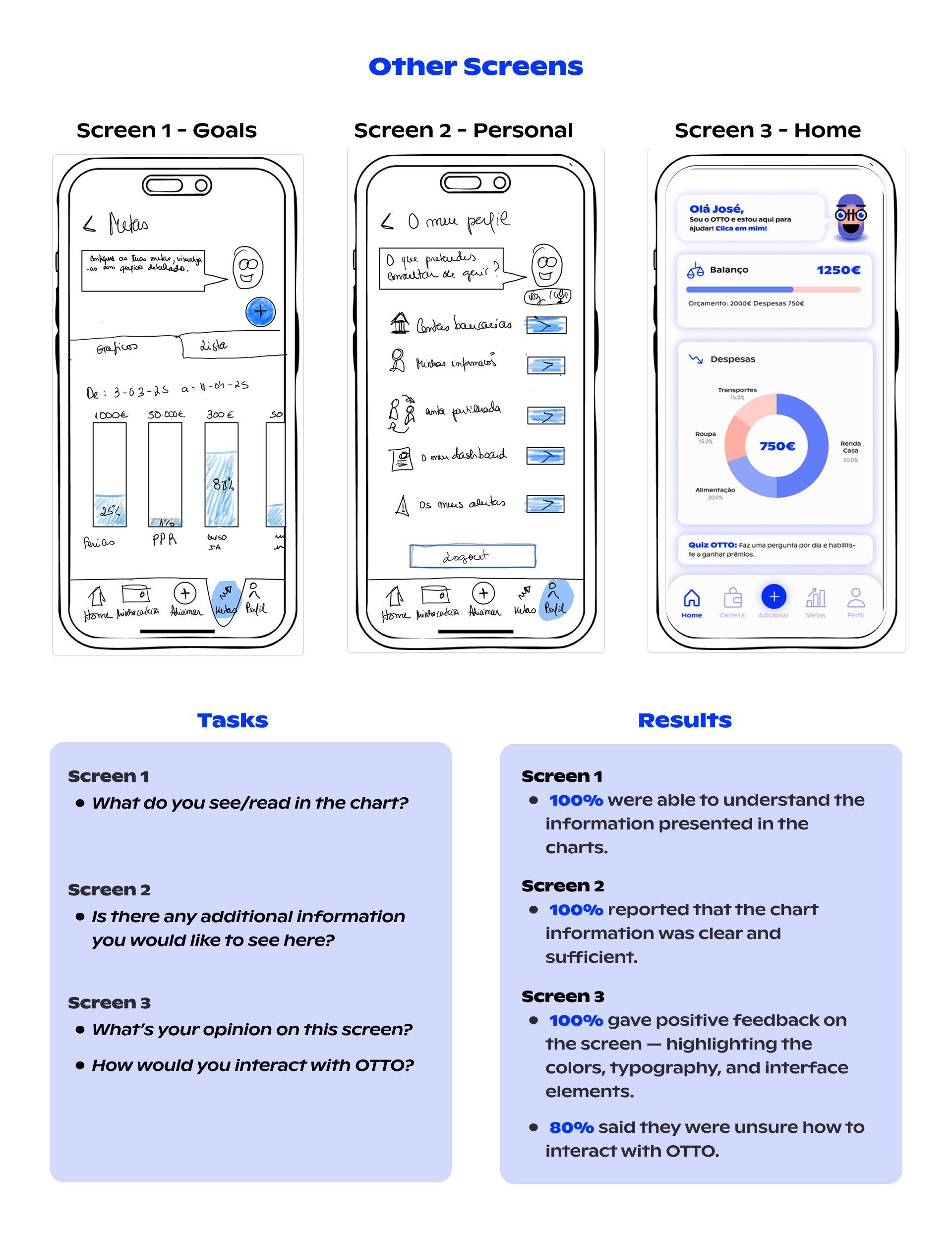
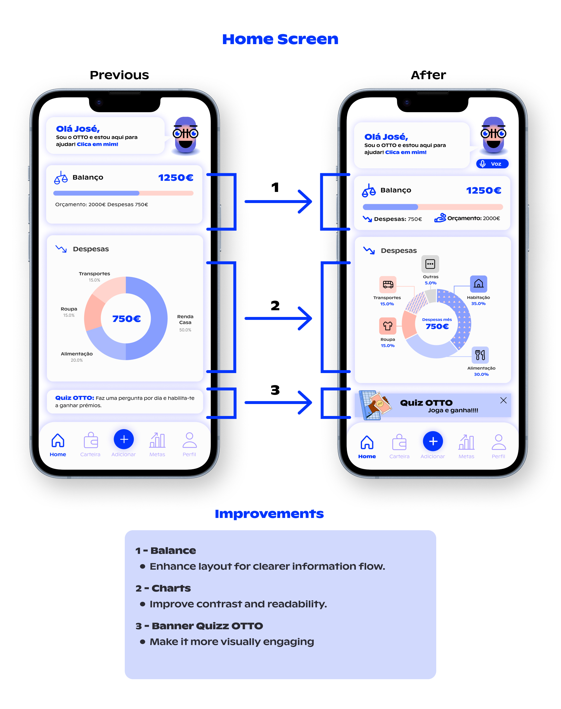
Here, a huge refinement was the home screen. It took a couple of revisions until we arrived at the final version.
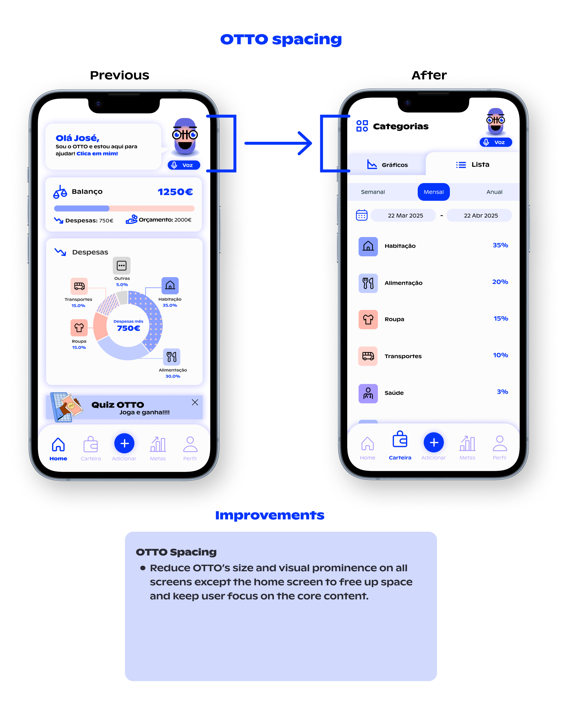
Another relevant part was the spare space with the OTTO size adjustment. It improved the distribution and sizes of other components in several screens.
User tests
Due to time constraints, I only conducted final testing with 3 participants. Still, the insights were very helpful. Some improvements would be needed, and those we will consider in the backlog.
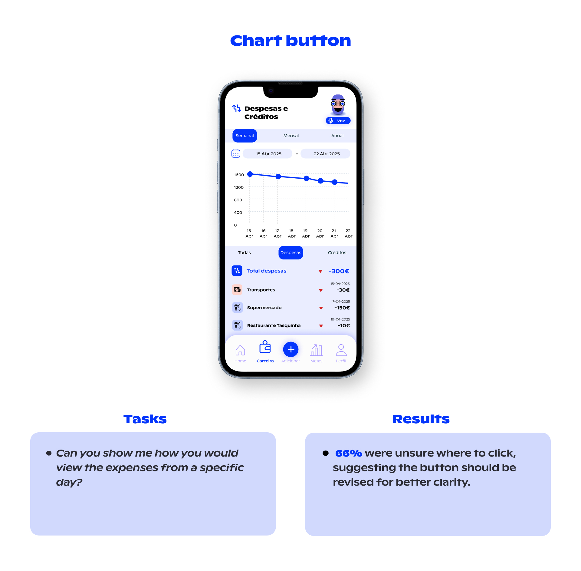
During the initial testing, we identified usability concerns around the “Add” button. I conducted further tests, but uncertainty remained regarding how intuitive it felt to users. Additional testing is recommended to explore alternative solutions. One possible solution to test could be the integration of contextual “Add” buttons directly within each thematic screen.
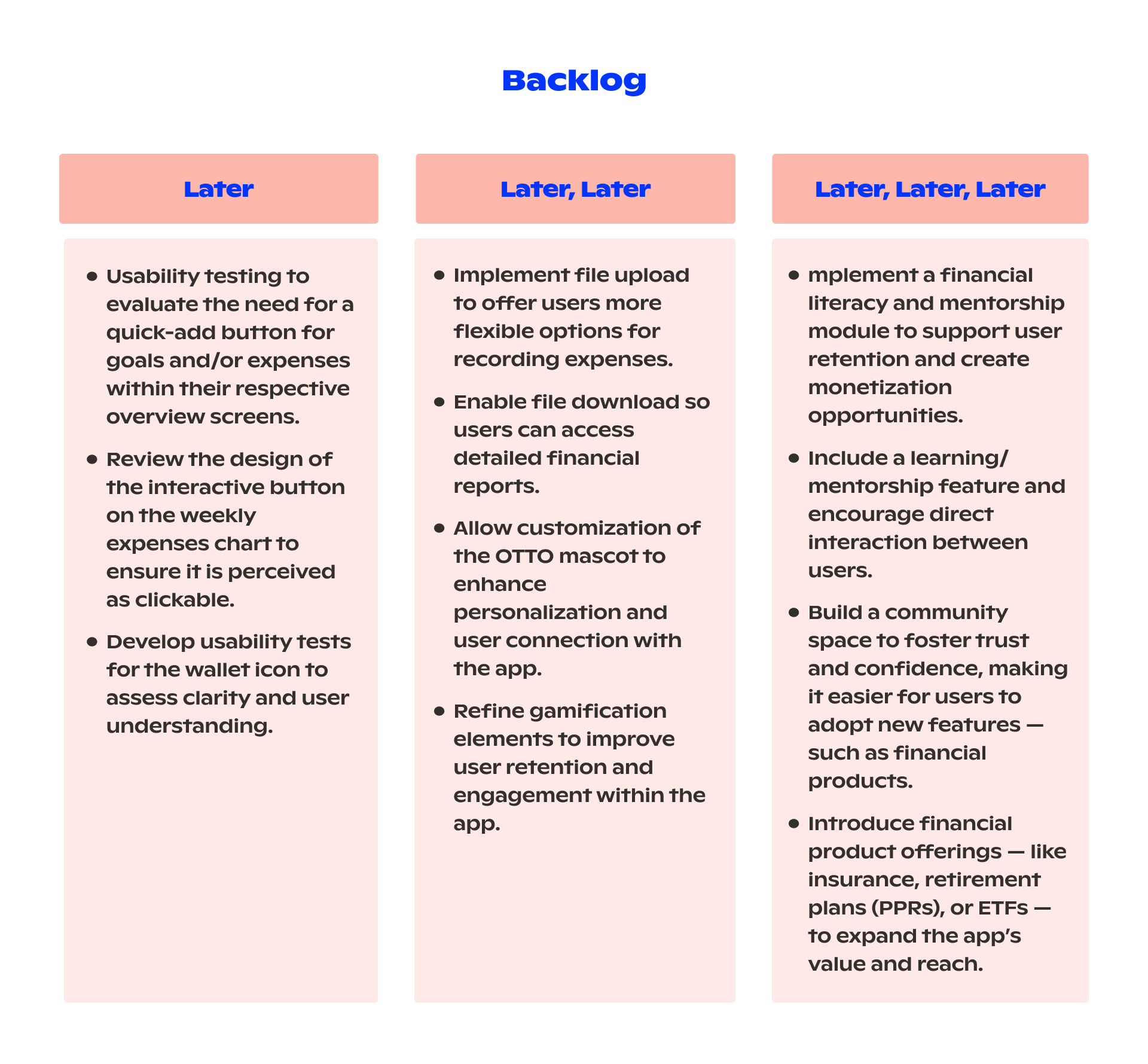
Backlog & Retrospective
Every phase went smoothly and followed the roadmap — except for the final testing, which took longer than expected.
We created a backlog of next steps, including suggestions from users, insights from usability tests, and our ideas for future improvements.