The soul of the visual identity
Because I believe the professional part of a person is the extent of his features, my brand reflects me
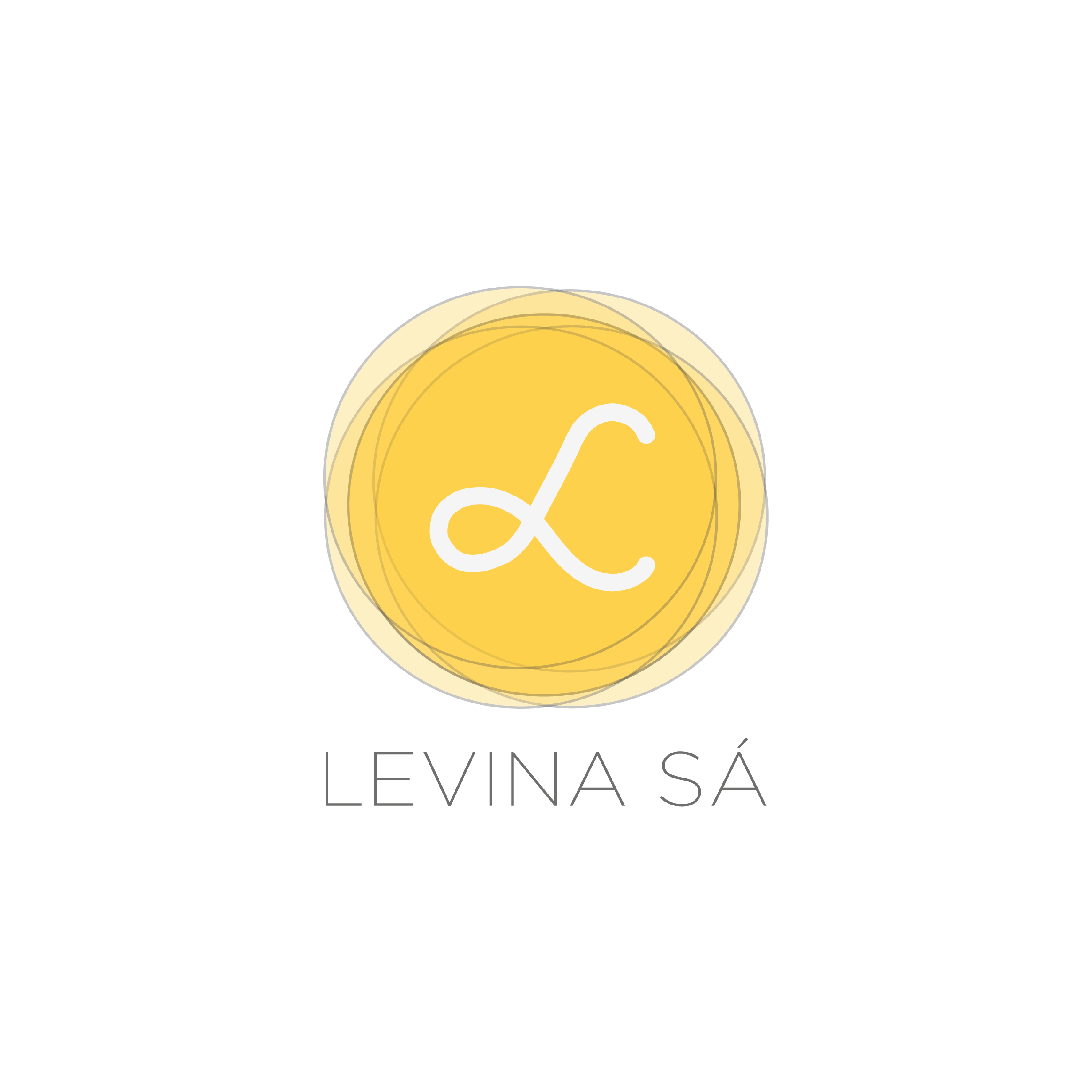
My Logo
Designing a logo for yourself can be challenging. As designers, we often strive for perfection, always feeling there’s room for improvement. I was no exception to this.
I took some time to reflect on my core values and strengths as both a person and a professional. This introspection illuminated the path ahead.
The logo of my brand was built thinking about these characteristics:
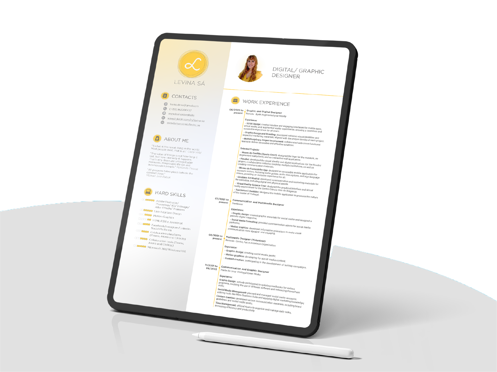
Curriculum Vitae Resumè
Aligned with the visual identity, I designed my resumè. With the predomination of white color, the simple and clean design is an essential presence on the design communicative line.
Simple and clean design
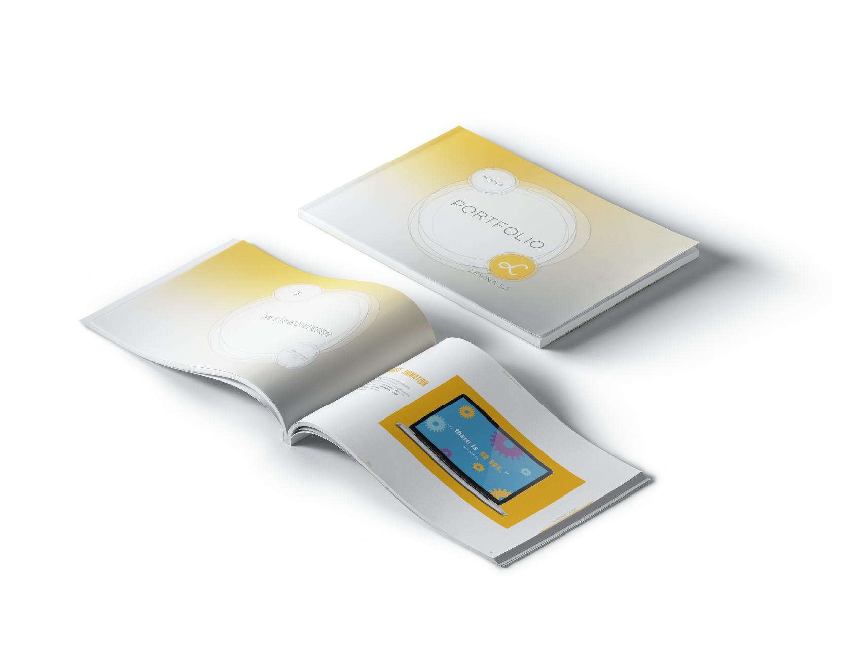
Portfolio
My portfolio also has the visual graphic line from my brand but with a strong visual impact. Its organization by theme helps make it easy to understand. The most relevant work or project has a link for more information.
As a lover of quotes, I have chosen to introduce each theme with a relevant quote to provide context and inspiration. This is consistent with my resume, which likewise incorporates quotes to provide a self-description.
Strong and organized