
Healthcare Digitalization is a reality
More than Primary Care Center services at the patient’s fingertips
About the project
When I study new things, I love to put them into practice, and this project was about that. Besides that, it conciliated two of my work areas: healthcare and design, and this was amazing and so pleasant.
This project marked the culmination of my comprehensive UX and UI design course, where I executed the full design process—from initial research and discovery to final prototyping and testing. As a healthcare professional, I infused real-world insights into every stage, combining creativity with effective problem-solving. The project was both challenging and exciting, offering a unique opportunity to bring innovative digital healthcare solutions to the industry.
The project’s scope encompassed:
Discovery phase
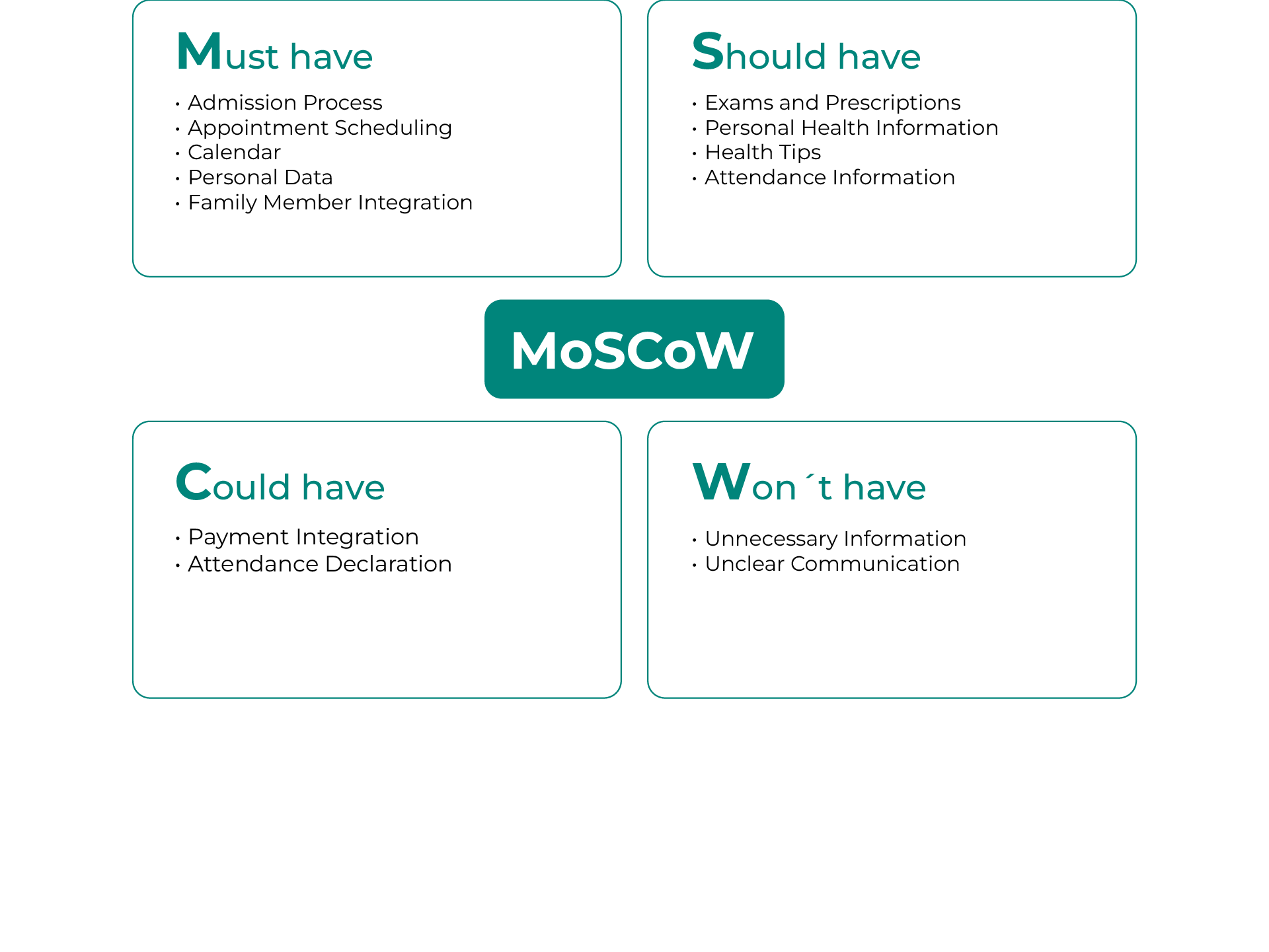
I initiated the project with a research phase, analyzing both public healthcare services and comparable private institutions. This analysis helped identify key opportunities to improve patient engagement and streamline processes. I employed methodologies like MoSCoW prioritization, the 5 Whys technique, and quick benchmarking. This way, I shaped a clear product vision centered on user-centric design principles.
Key answers for the future process:
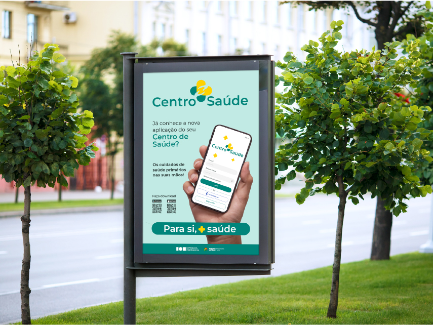
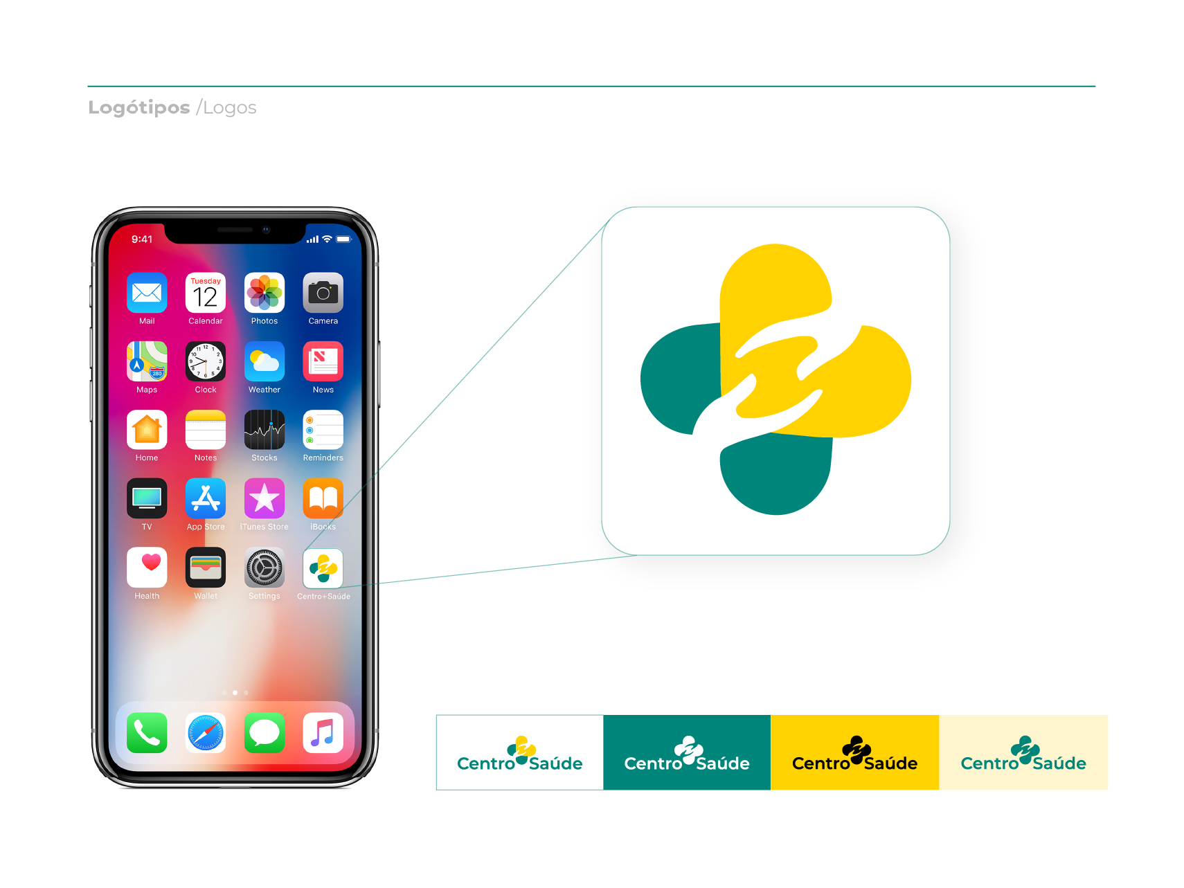
When developing the brand identity for this healthcare app, Centro+Saúde (translated as “More Health Center”), I prioritized a short and meaningful name. After researching other healthcare app names, I concluded that the brand should reflect the core value of health.
Key design elements:
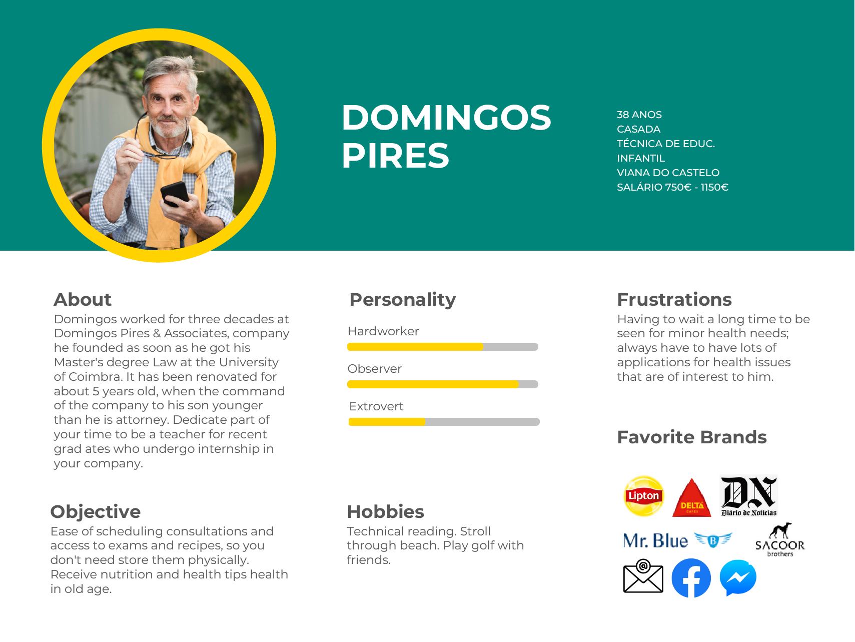
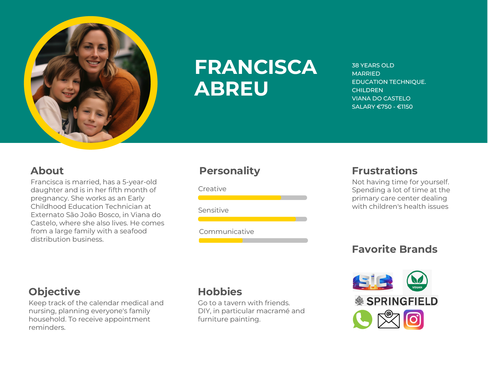
Proto-personas, representing the user
Personas are a crucial tool for understanding our target users. By developing detailed personas, we can gain insights into their needs, behaviors, and motivations. This was a fun part for me because I love to imagine stories.
For this project, I created two profiles: Domingos Pires and Francisca Abreu.

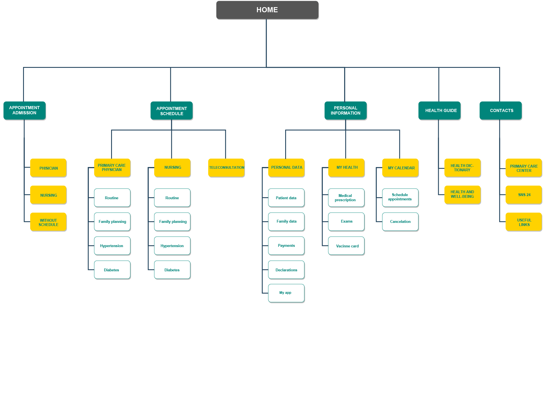
Sitemap
At this stage, I began constructing the app’s information structure, drawing on the information architecture principles.
Some themes had pain points where they should be located in the app, such as the separation of “schedule an appointment” and “admission for an appointment”. Those were only solved after more research about the service’s workflow.
Paying attention to the users’ needs, Domingos and Francisca, I kept in mind the importance of the calendar, admissions, and scheduled appointments. I didn´t forget Domingos’s worries about knowing more about health habits, and Francisca has to manage the primary healthcare of 2 kids.
This site navigation guide outlines a user-friendly structure for the healthcare services app. Key sections include:
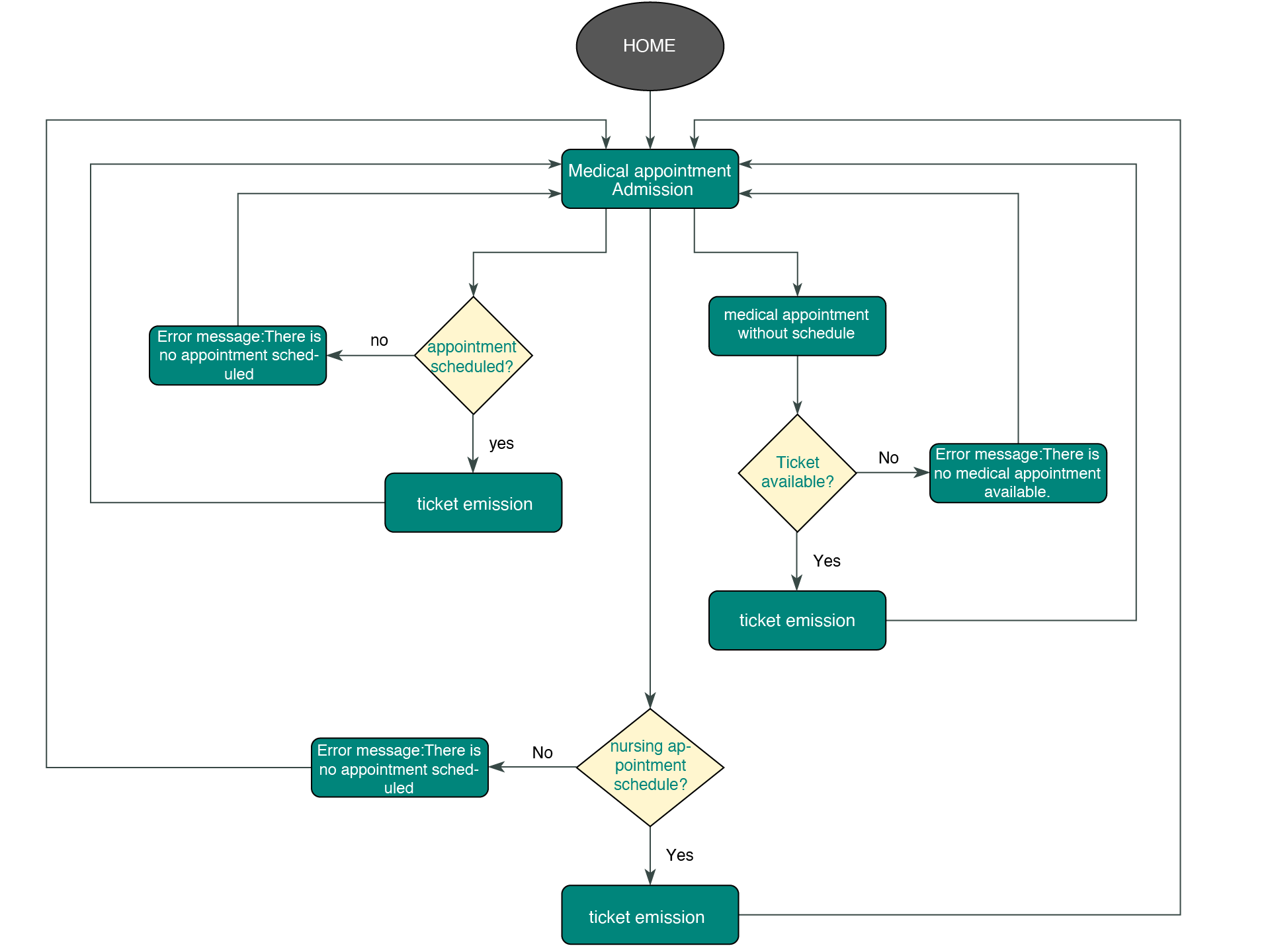
User flow
This step was crucial to ensure that I understood the entire app picture in more detail.
The user flow for a medical appointment scheduling system showed the user steps through the different processes. It delves into the patient journey from appointment request to confirmation, including ticket issuance for confirmed and missed appointments and error handling for various scenarios.
This user-centered design ensures a seamless and intuitive experience for patients.
Wireframing
I meticulously crafted high-fidelity wireframes to refine the user interface and ensure a seamless user experience. Before diving into digital tools, I began with traditional hand-drawn sketches – low-fidelity wireframes – to explore layout options and visual hierarchy.
This stage allowed me to:

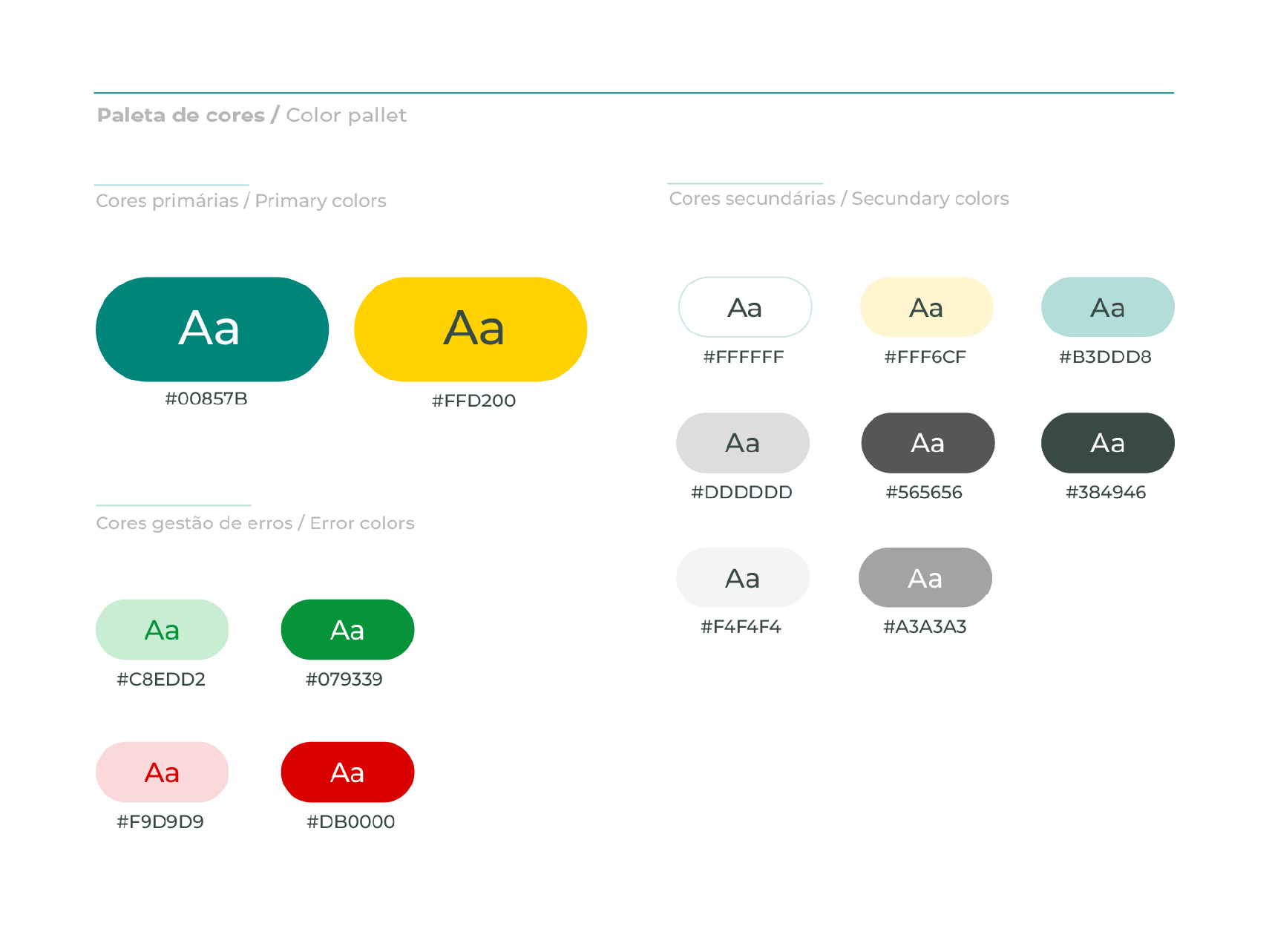
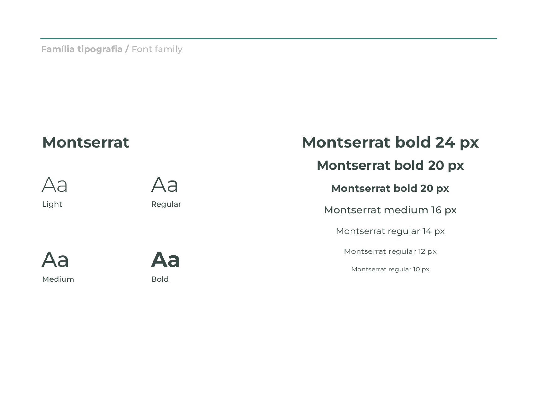
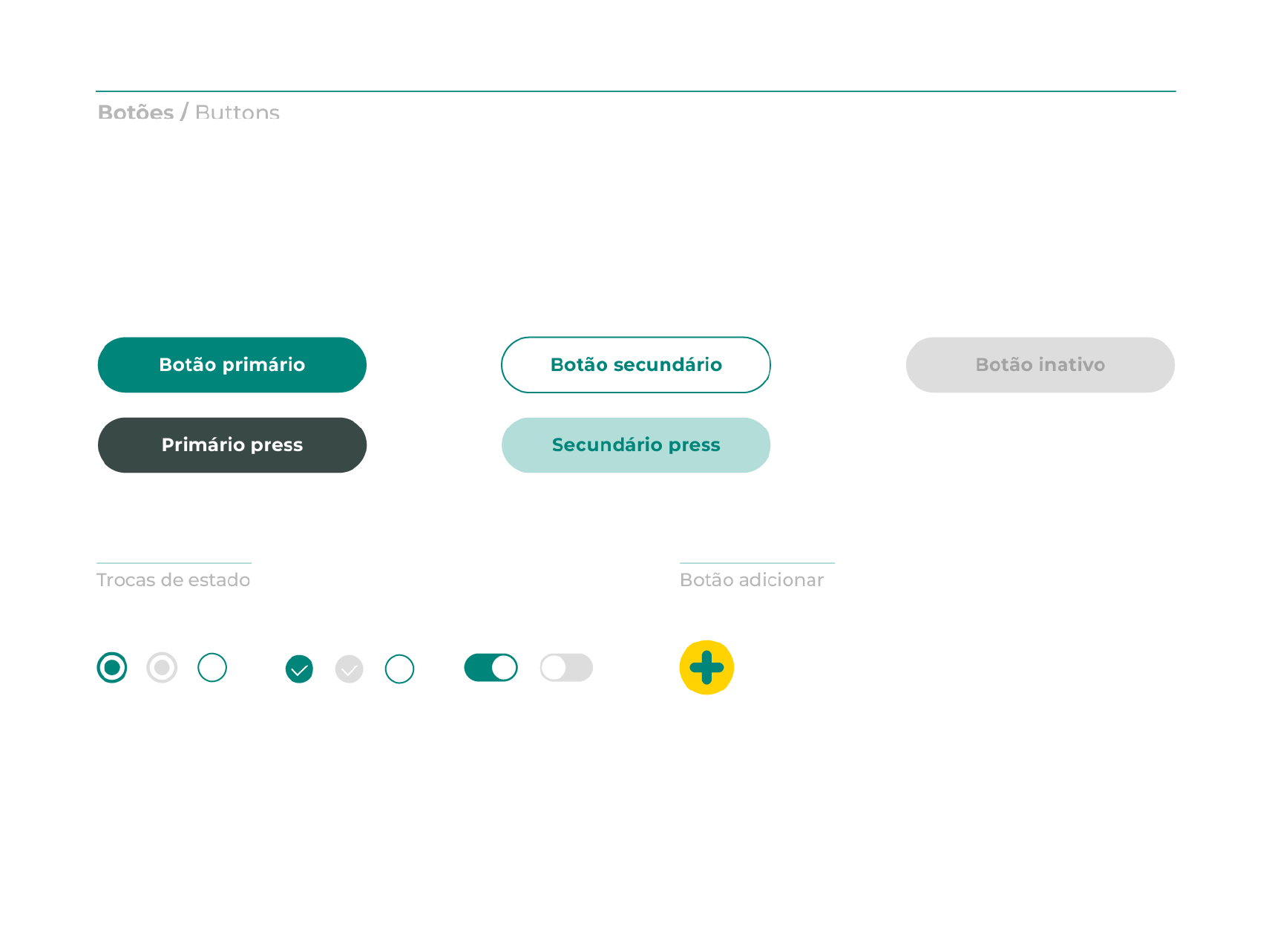
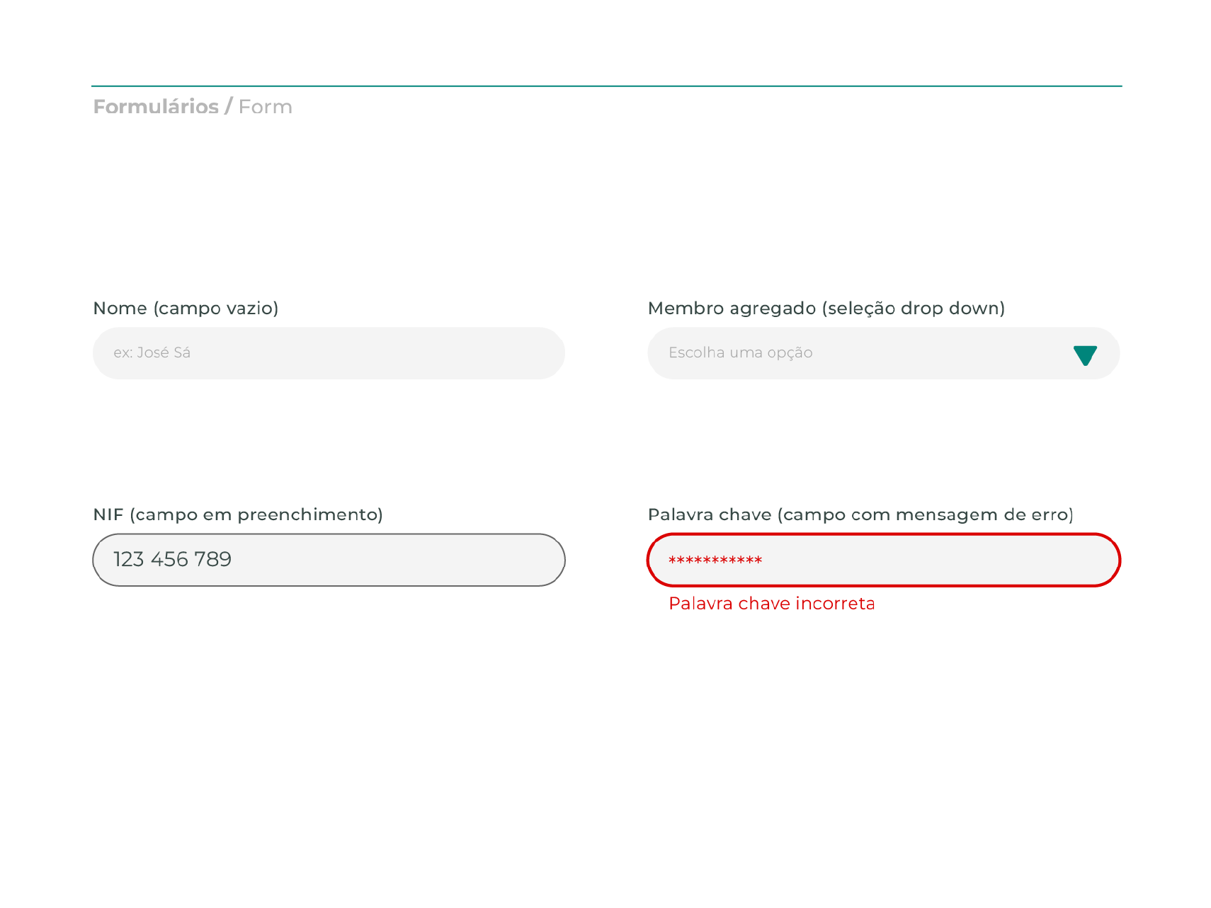
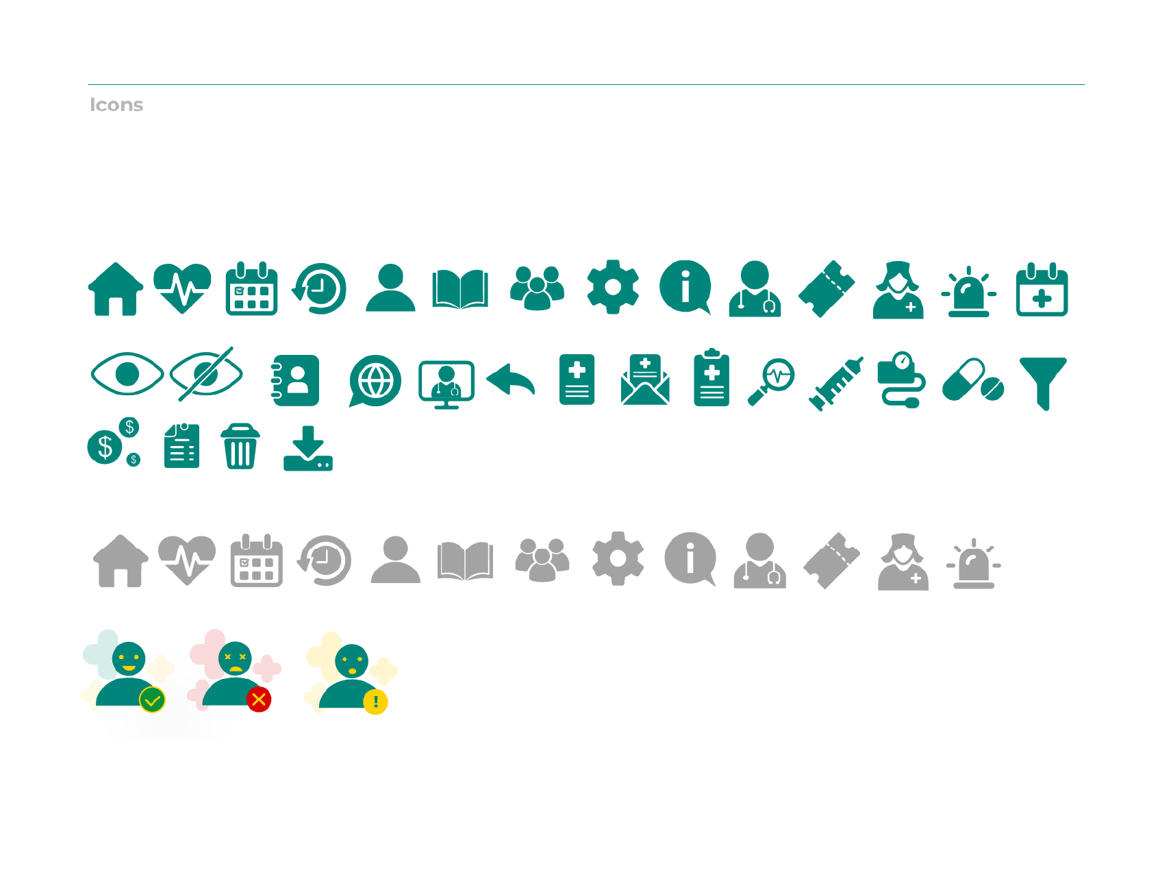
Style Guide
It was time to start the interface design and create the UI elements.
This was when I chose the app’s clothing, which influenced its personality and emotional impact on the user.
At this stage, it was important to consider accessibility topics.
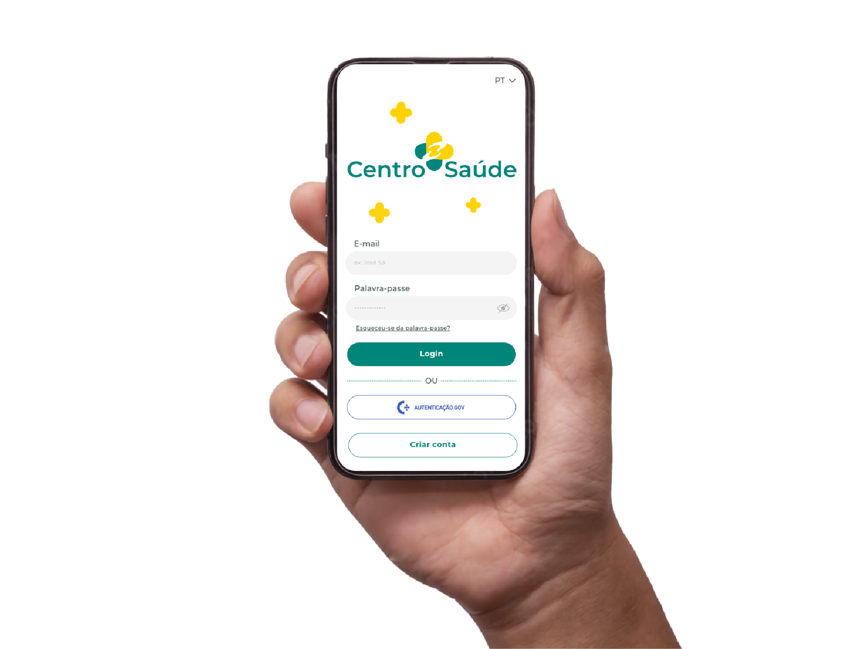
The Prototype
The prototype phase brought the app’s personality and user-centric design to life.
During this phase, I identified potential connection issues and refined user flows that were not as intuitive in earlier stages. The prototype allowed me to test and improve the user experience, ensuring the app was functional and engaging.
The heuristic test demonstrated points where best usability practices and best design approach were not applied.
Here are a few examples of key improvements I made:
The resulting prototype is a streamlined, user-friendly digital healthcare solution that meets its core objectives while providing an intuitive, engaging experience.