Visual identity is the essence
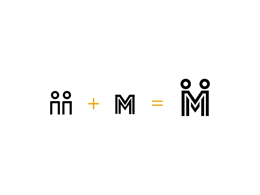
Sometimes the obvious doesn´t have to be in the logo composition
About this work
Who would imagine a courtroom as a cultural hub? This museum transformed a space of justice into a captivating story of Porto. The museum offers a unique perspective on notorious cases, historical documents, and antiquated tools.
I enjoyed working on this project as a member of ByAR – Augmented Your Reality. My role was to design the visual identity, UX and UI interactive wall app, introductory video storyboard, and augmented book.
This project was developed as a team member of ByAR – Augmented Your Reality, where I worked as a designer. All rights reserved.
My role focused on crafting:
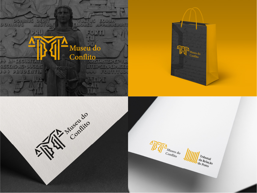
Logo design
As a designer, I was tasked with creating a logo that aligned with Oporto Court’s existing brand identity while incorporating unique elements. To achieve this, I carefully considered the client’s specific requirements:
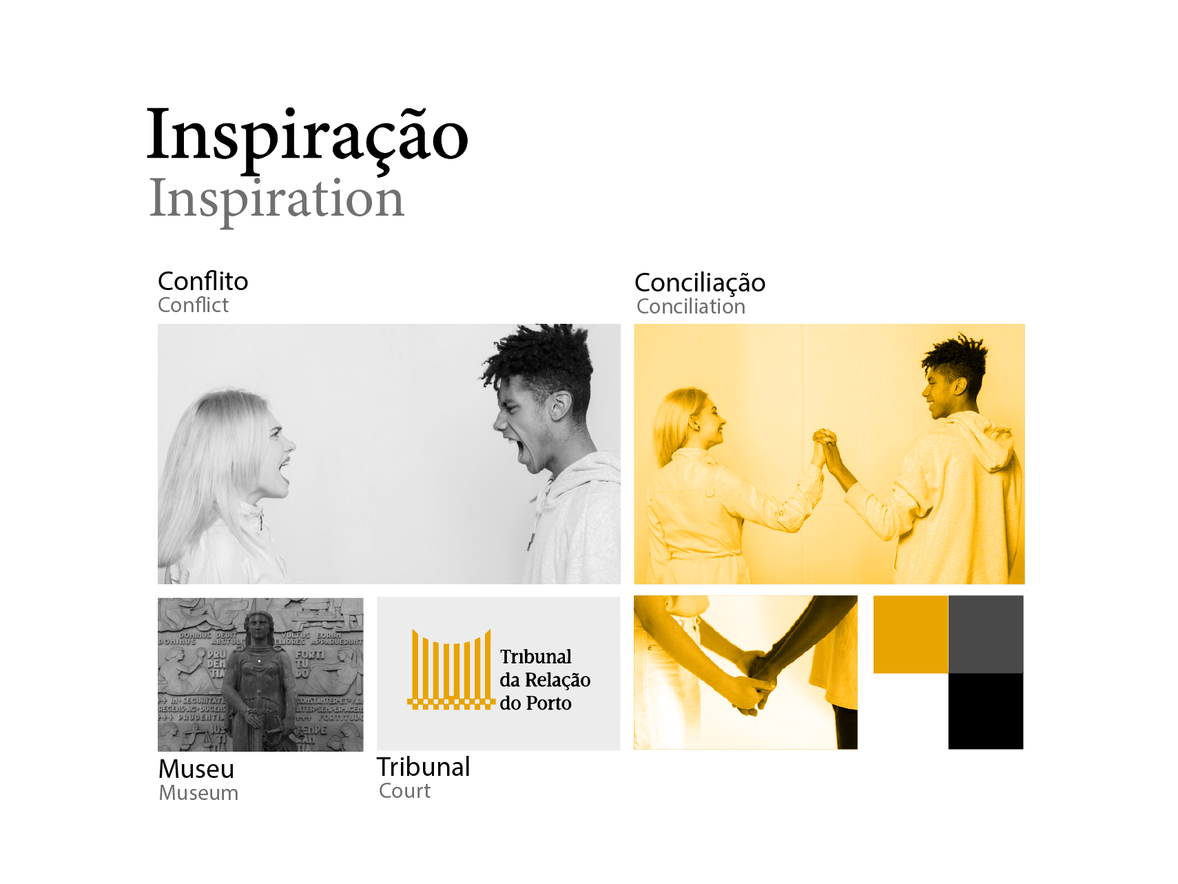
So, I explored various design concepts, including:
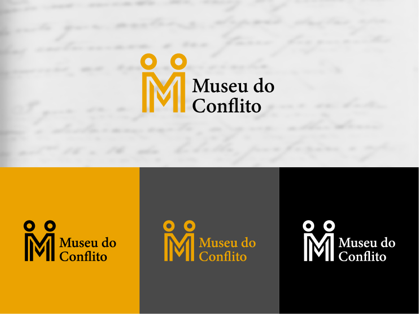
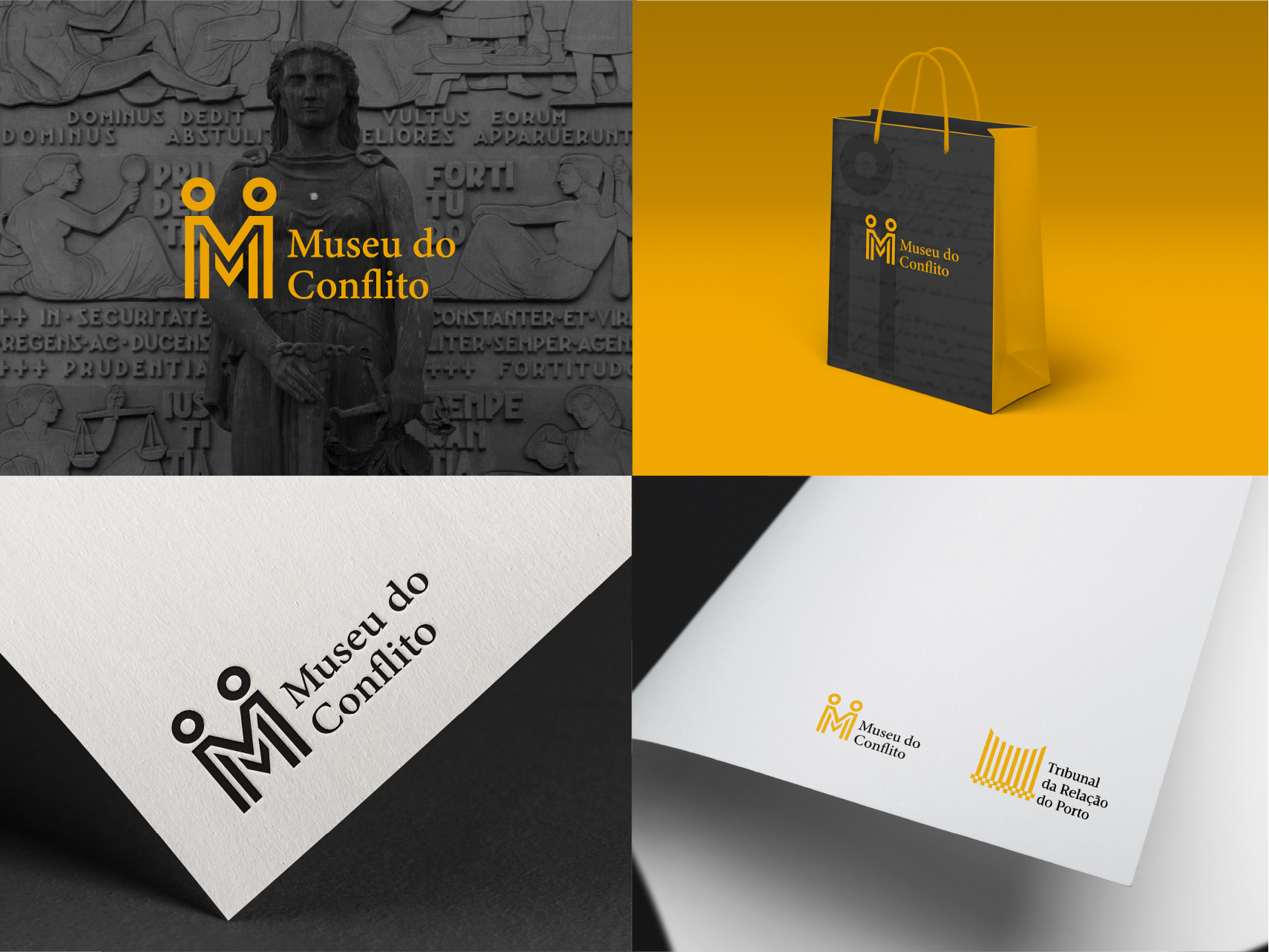
Logo proposals
Following the previous main ideas for the logo, two proposals were developed. The graphics were very similar, but the logos incorporated different concepts.
First proposal
This one was more balanced and aligned with the client’s transmitted ideas.
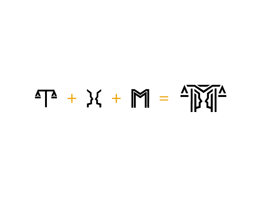
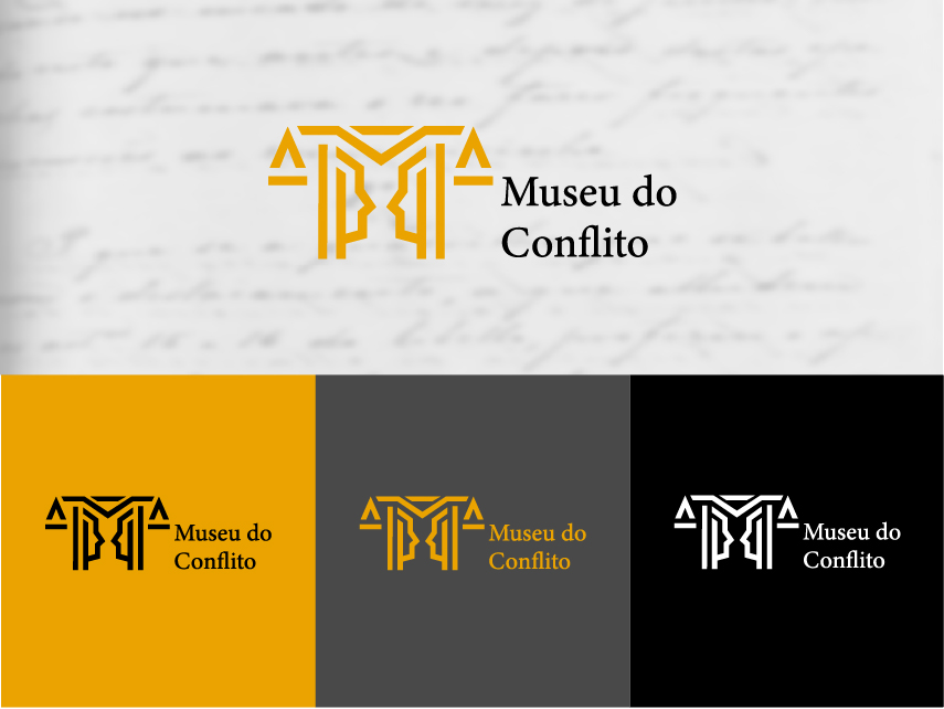
Second proposal
This was a backup proposal in case the first one failed in its purpose.
This logo contains:
Interactive wall application design
In addition to the logo, I was responsible for designing an interactive wall and the accompanying app interface. The app allowed visitors to explore various justice-related themes, including historical context, future perspectives, and intriguing facts.
A cohesive design
To create a cohesive design, I incorporated the color palette and design elements from the existing logo. The app interface was designed to be:
A video with antagonist concepts
At the entrance, there should be a video where justice-related concepts should be explored. I also participated in its creation, being responsible for the storyboard.
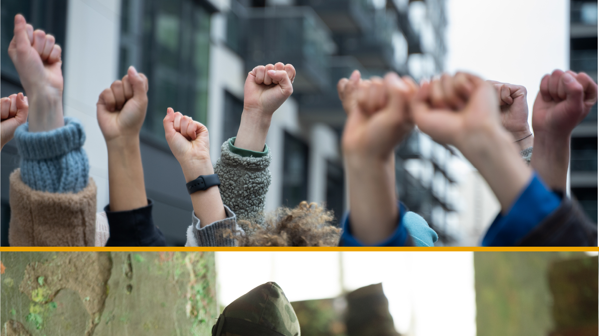
The video should present “bad” and “good” actions.
I did the storyboard thinking about how to highlight their opposing nature.
How can this contrast be emphasized?
To emphasize this contrast, I employed the brand’s primary colors. Yellow and white represented “good,” while black symbolized “bad.” This color scheme was consistently applied throughout the video, with images depicting negative concepts appearing in black and white when juxtaposed with positive concepts.
Interactive Justice Cases Book
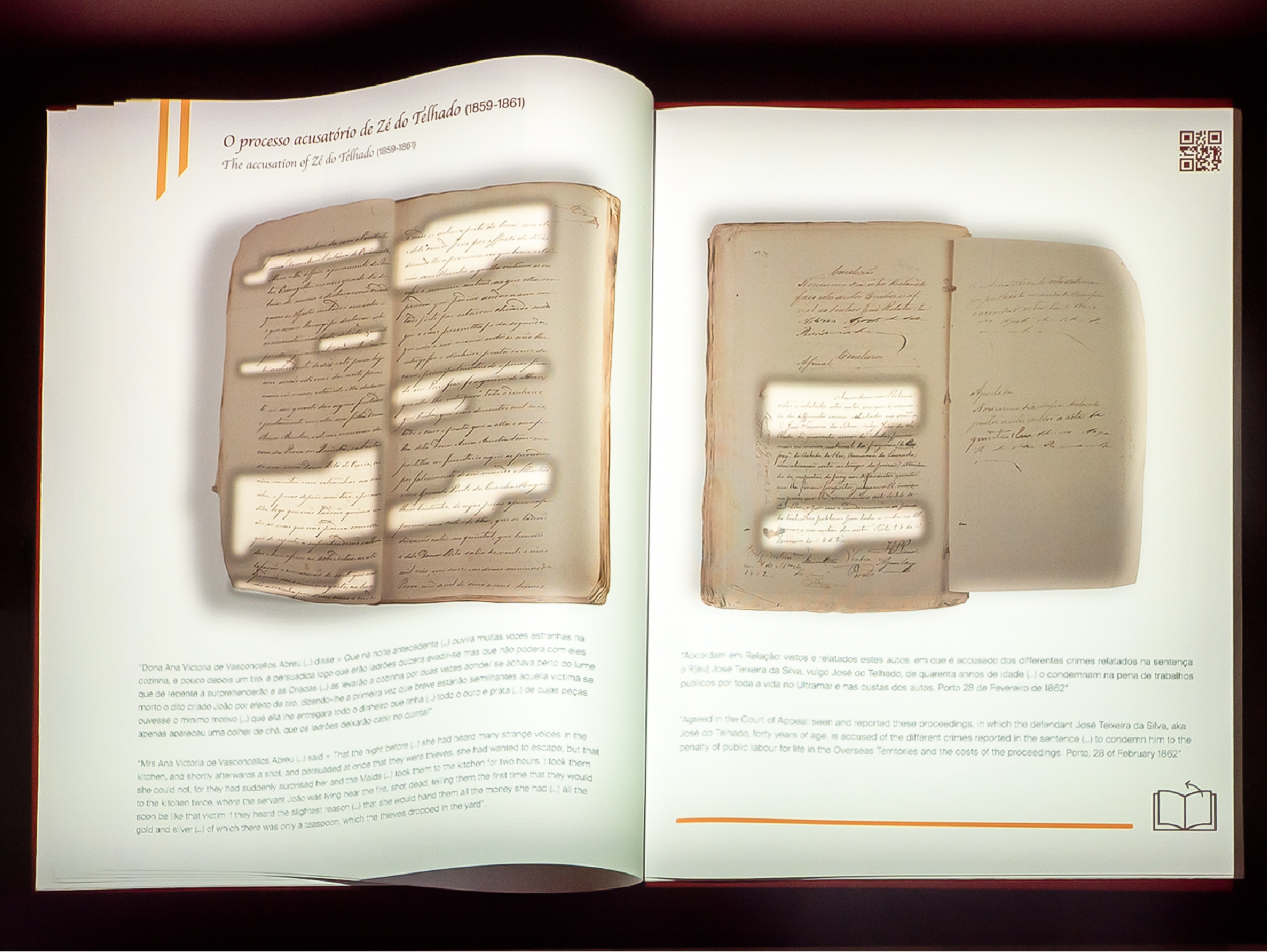
Last, for telling the emblematic stories of some justice cases, nothing more appropriate than a book, but not a boring one.
What is in it?
The book incorporates animations to visually illustrate key aspects of the justice process, making it a more engaging experience for visitors.
The book’s design seamlessly integrates with the overall museum theme, featuring the main color associated with the justice section where it was displayed.


