

Audisense, your hearing care online
A bilingual e-commerce platform bringing hearing aids to people at home, with lower prices and real audiologist care
About the project
I love projects that mix two things I care about: real problems and new ways of working. This one started from both at the same time. I wanted to understand what AI-assisted development really means for a designer, not in theory, but by actually doing it. And from conversations with audiologist friends, I found a real business to build a product around.
This was everything new for me. I didn’t just design the product; I built it. I was the Product Owner, the designer, and some kind of developer (or should I say, Claude was the hard worker and I was the decider). I guided Claude through the research, the strategy, the architecture. In code work, I asked for advice but also set some rules and found some flaws.
This case study is the first of two: here I show how the product was discovered and shaped. In the second (a different page), I show what my experience was like building a product with AI.
The project’s scope encompassed:
Where it started, the problem and the opportunity
I love it when two things I care about meet in the same place. This project started exactly there.
I wanted to understand what vibe coding really means for a designer, not in theory, but by doing it. With audiologist friends, I found a real business to build a product around, an import and business idea from the US: an e-commerce site for hearing aids.
Both mattered equally. The curiosity gave me a reason to build. The opportunity gave the build a purpose.
The opportunity
In the US, this was solved long ago. Hearing aids are sold online. No store, lower prices, and the audiologist still prescribes and supports the patient remotely.
In Portugal, the same clinical rules already exist, but no one has built the online experience yet.
The problem to solve
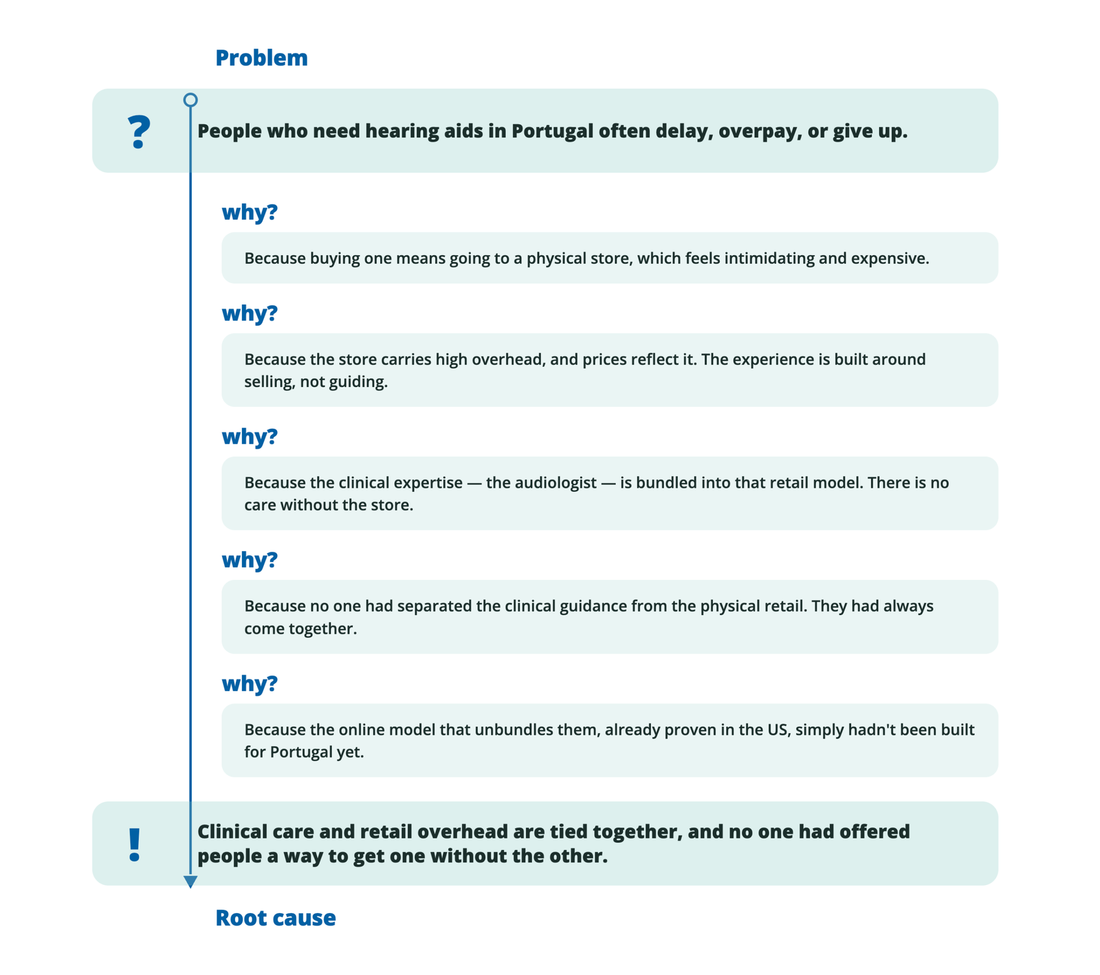
Someone needs a hearing aid. They go to a physical store, where prices are high, and the choice feels overwhelming. There’s no calm way to research at home, no way to compare, no time to think. And the audiologist who should guide you is tied to a retail experience built around selling.
For an older audience, or the family helping them, it’s harder than it should be.
Benchmarking
Before building anything, I wanted to see how people actually buy a hearing aid in Portugal today. Not the marketing version, the real experience.
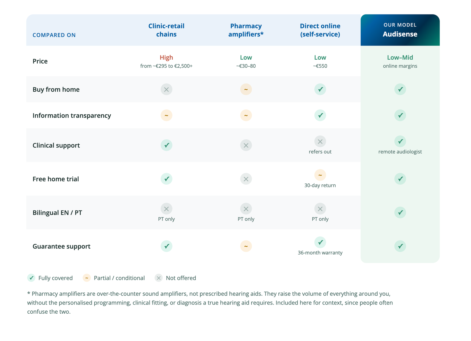
I found three routes, and each one asks the buyer to give something up. The clinic-retail chains offer genuine audiologist care, but only inside a physical store, at prices that climb into the thousands. Pharmacy amplifiers are cheap and easy, but they’re not really hearing aids, they just make everything louder. And an online seller already exists, offering low prices and home delivery, but it hands you a ready-made device and points you elsewhere the moment you have a real question about your hearing.
So the pieces were all on the table. Nobody had put them together.
Personas
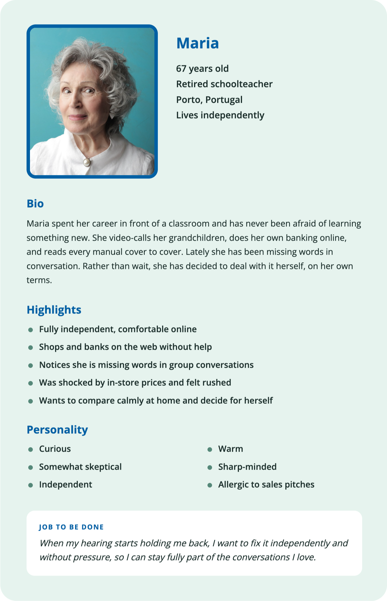
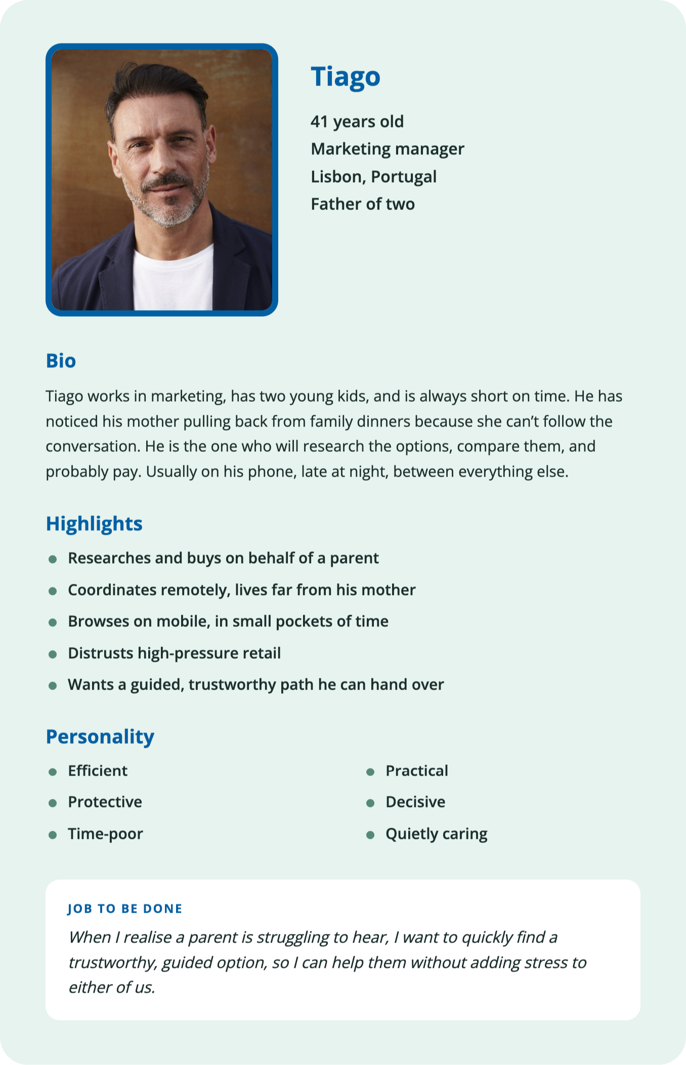
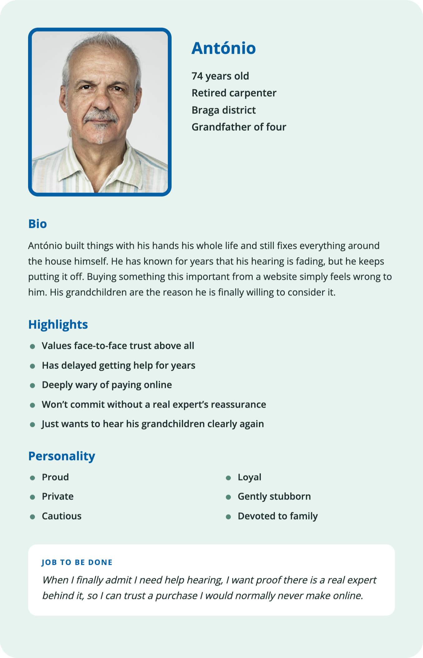
Three people, three very different ways the same decision gets made. Designing for all three, not an average of them, is what shaped Audisense.
Ideation and organizing the ideas
What ships first
A full map of a site is not a plan for building one. Before anything else, I had to decide what a first version truly needs, and what it could live without.
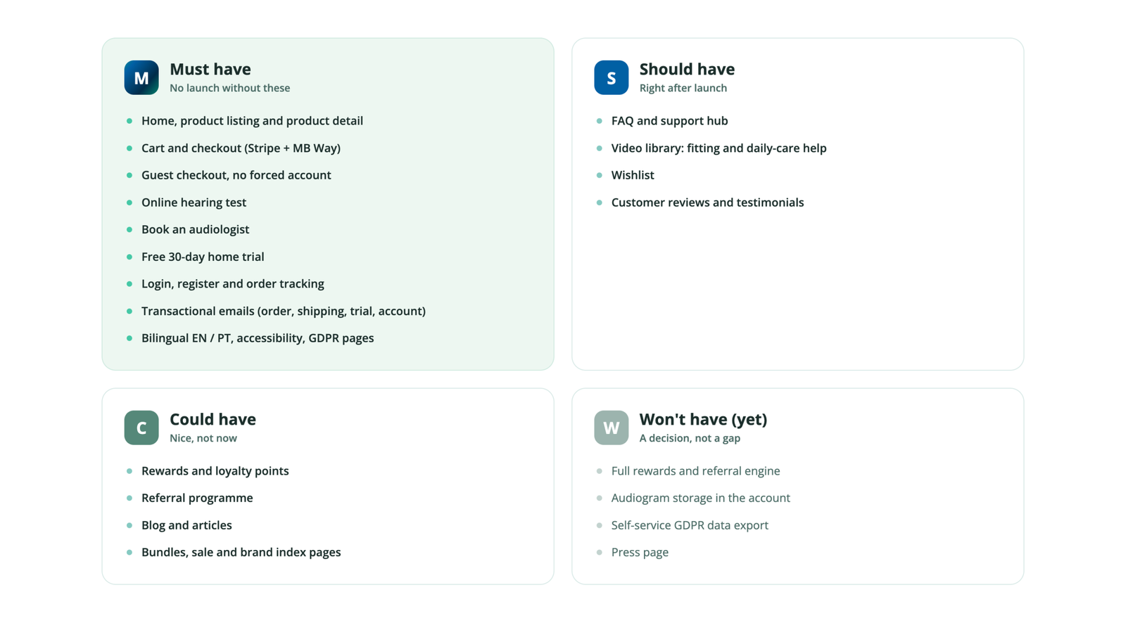
I sorted every feature with MoSCoW: Must, Should, Could, Won’t. The honest part is the Won’t. Rewards, referrals, the blog, and self-service data tools are all genuinely useful, but none of them help someone buy their first hearing aid. So I hid them from version one on purpose. That is not a gap, it is focus.
A few features earned their way up into Must, and the reasons matter.
The free 30-day home trial was the big one. It drags real backend work with it, so my instinct was to delay it. But the physical stores already let people try before they buy. Launching without a trial would ask the most nervous buyers to take a risk the high street never asks of them. So it moved up.
The transactional emails came with it, because a trial that never tells you what is happening is a broken one.
And the video library moved into Should, not as extra content, but because seeing how simple a hearing aid is to fit and clean is itself a reason to trust the purchase.
Every feature that made the cut serves one job: helping a hesitant person research with trust, and buy with a real audiologist within reach.
The structure
An e-commerce site for hearing aids is not a small thing. Products, variants, a trial programme, a hearing test, blog content, audiologist bookings, an account area, a full checkout, and all the legal pages that health data demands. Left alone, it grows into a maze.
My audience is the last group of people who should ever feel lost in a maze.
So the information architecture started from a single question. Not “where does every page go,” but “what is this person trying to do, and how do I get them there with the fewest wrong turns.”
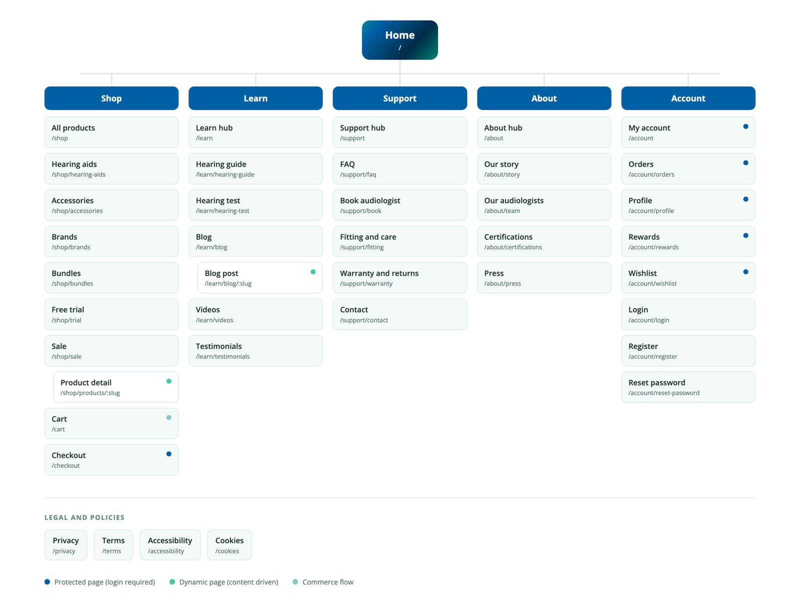
Five clear places, not fifty
Everything collapses into five areas a person can hold in their head. Shop to browse and buy. Learn to understand hearing loss without pressure. Support to get help from a real audiologist. About to build trust in who is behind this. Account to manage orders and rewards.
Each one is a calm front door. Behind it, the deeper pages branch out, but nobody is ever forced to see the whole map at once. You go where you need to go, and the rest stays quiet.
Designing for hesitation
Two things shaped the structure more than anything else.
The first is that many buyers are anxious and unsure. That is why Learn and Support sit right beside Shop, as equals, not buried in a footer. A person can research, take the hearing test, or book a call with an audiologist before they ever think about buying. The path to reassurance is as short as the path to the cart.
The second is that a lot of purchases are made by someone else. An adult child, buying for a parent. So the account area, the order tracking, and the guided journeys all had to work for a person acting on behalf of someone they love, often from their phone, often late at night.
The quiet decisions
A few choices in the map are deliberate and easy to miss.
Guest checkout exists so no one is forced to make an account to buy. For an older buyer, a forced registration is often where they give up.
Protected pages are marked clearly. The account area and checkout require a login, but everything that helps a person decide stays open to all.
And the legal and policy pages sit apart at the base, always reachable, never in the way. When you handle health data, that is not decoration. It is a promise.
The result is a large site that never feels large. Every route has a reason. Every person has a path.
Comming soon
What’s next
I am working on finishing the project. Soon I will put the process here, how was to work with AI, what problems were faced, and how I handled them.